Institutional Colour Design
Evidence-based colour strategies for institutional design recommend using hues that are familar and homelike, and to minimise strong contrasts. These colour strategies are more likely to invoke positive response, enhance feelings of wellbeing and convey a sense of calm.
Research indicates that the absence of colour or the use of institutional colours such as clinical white, hospital green and grey, can be perceived as alienating, cold and depressing. These types of colours and a focus on functionality may be counter-productive given the ongoing impacts of confined space, lack of privacy and independence coupled with feelings of loneliness and vulnerability plus the relatively high rates of mental health disorders among prison residents – up to 49% in Australia.
Key recommendations
A range of hues should be used to create a sense of visual variety and colour can be used to attract attention to key environmental features or to camouflage features such as exterior fencing. Colour can be used to identify different zones and strong contrasts should be avoided to minimise visual distractions and help to engender a sense of calm.
Juniperina Juvenile Justice Centre, Sydney
This institutional colour design was prepared for the Juniperina Juvenile Justice Centre, Lidcombe. The client, Paul Bardsley of the Department of Public Works, required a colour scheme that was both ‘homely’ and ‘calming’ and which would create differentiation between living units, common areas and staff areas.
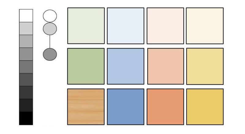
A limited range of selected hues were used to create a homelike ambience. This was an important factor as many of the residents were young and far from home and community. Colour was used to identify different zones within the centre as well as individual rooms, which residents could also personalise.
To minimise visual complexity (visual noise) and resulting visual dissonance, a high to intermediate key minor chord with minimal tonal contrasts featured in the scheme. The relative lack of tonal contrasts meant that attention was not constantly highjacked by strong contrasts. In this way, visual experience of the facility was designed to invoke a ‘calm’ ambience.
A tinted, greyed green was specified for the perimeter fencing as this colour would ensure that the fencing blended visually with the gum trees planted around the perimeter of the site. This resulted in a relatively colour-camouflaged perimeter fence, thereby partly reducing the institutional nature of the landcaped areas.
This was a collaborative project undertaken with environmental psychologist Rohan Lulham, 2006.
