Cinema Palettes on Instagram. Launched in October 2016, @cinema.palettes explores the use of colour and contrast in film, music videos and television. Check out Instagram @cinema.palettes here
Colour and contrast can play key roles beyond aesthetics. Film makers use colour, contrast and saturation as well as colour placement for a range of reasons. Specifically, to convey symbolism, support character development, enhance mood and themes, signal tension and reinforce plot lines.
Whilst we may not always notice colour and contrast in film, a lack of visual cohesion can lead to cognitive dissonance that may undermine or negatively impact viewer response. Check out all the latest cinema palettes at Instagram @cinema.palettes here
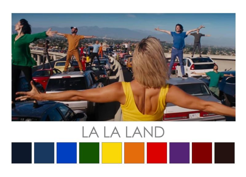
La La Land (2016). Damien Chazelle’s film is a visual and auditory feast. An unlikely romantic musical comedy-drama that focuses on the Hollywood dream, colour and contrast play starring roles from the riveting opening scene through to the end. Saturated primary and secondary colours feature in the opening scene and are repeated throughout many of the film’s scenes. These unadulterated, full-chroma colours hint at the artificial nature of Hollywood but also reflect the undiluted hope of young actors and musicians trying to make it in Tinseltown. Saturated colours flood our view of the party scene and the Hollywood sets as we wander through them with the main characters, Mia and Sebastian. Caravaggio-style strong light-dark contrast is used effectively but sparingly to highlight the connection between Mia and Sebastian, and draw attention to the haunting Jazz piano melodies played by Sebastian. Night scenes are drenched with moody blues, a visual reference to the close connection between the Blues and Jazz music. The brightness of the colourful opening scenes begins to fades imperceptibly into slightly more muted colours for the closing scenes as Tinseltown dreams segue into reality.
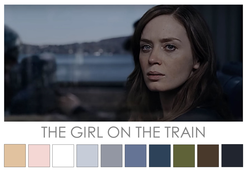
The Girl on the Train (2016). Tate Taylor’s film of Paula Hawkins’ bestseller features a moody background palette comprised of a low major tonal chord in marginally desaturated blues, greens and browns. This palette sets the tone for the main character Rachel Watson’s winter of alcoholic discontent. Through a blurry haze, Rachel sees a “perfect couple” from the train, who are highlighted in lighter, cleaner hues of white, peach, honey tones, that contrast with the moody, muted background palette. This contrast sets up a visual tension that links to the murder mystery plot. Symbolic of trust, reliability and stability, blue is a constant feature throughout the film and draws attention to Rachel’s doubts: Who would you trust if you can’t trust yourself? Blue features on the perfect couple’s house shutters, Rachel’s ex-husband’s house, train seats, clothing, cars and in virtually every scene. Blue also signifies the melancholy that consumes Rachel and questions our assumptions about who is trustworthy and happy among the film’s cast of characters. Check it out – Instagram @cinema.palettes
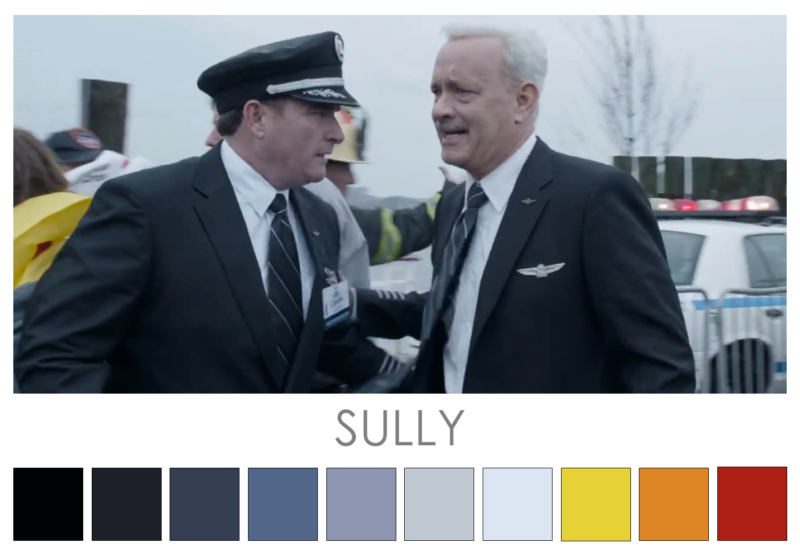
Sully (2016). Clint Eastwood’s film features a tightly controlled cinema palette. The predominant colours that feature throughout the film are tones of blue. These support the narrative by conveying a sense of the cold weather, watery landing of Chesley Sullenberger’s plane on the Hudson River, NYC, and the cold reception that Sully receives from the NTSB investigators after the incident. In addition, tones of blue – a colour often associated with reliability and dependability – reinforce the capable, professional characteristics of Sully, the pilot who successfully lands the plane with 155 passengers and crew on the river. The blue background serves to highlight the dramatic of flashes of red, orange and yellow (first responders flashing lights, engine fire and life jackets) as they intermittently appear in the film. The film suffers from a relative lack of strong contrast which could have further reinforced the nature of the dramatic unscheduled landing and the clash between Sully and the NTSB investigators.
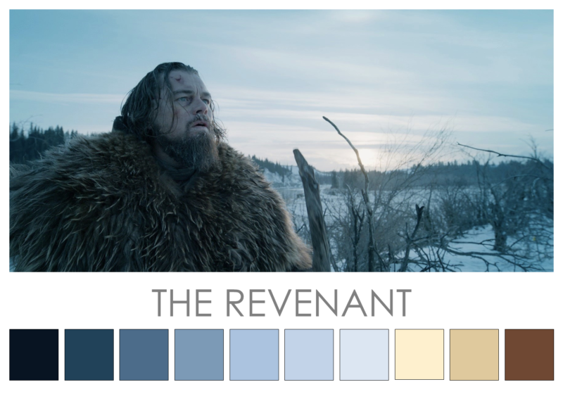
The Revenant (2015) Shot with natural light on location in Canada and the southern tip of Argentina, the cinema palette of this film is an essentially monochromatic blue palette. Director Alejandro González Iñárritu’s film features a range of tones in blues and greys, and these serve to immerse the viewer in the harsh winter of the central character’s struggle. The deliberate absence of a broader range of hues dovetails with the plot and intended viewer response. This predominantly blue colour palette is occasionally offset by the colours of fire and sunset, and these help to convey visual glimmers of hope. This warm-cool contrast between icy blue colours and warm colours symbolising hope seem to reflect the inner soul and determination of the central character. Strong light-dark contrast creates an icy chiaroscuro effect that supports the mood and narrative of the film. The film colours fall into a major tonal value chord featuring predominantly muted, cool colours. Check it out – Instagram @cinema.palettes
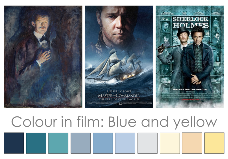
Blue and Yellow film colour palette. The pairing of blue and yellow as a common film colour palette aesthetic owes much to Wolfgang Goethe, who suggested that colours occur in opposition with each other. In Theory of Colours (1810), Goethe espoused two primary (blue and yellow) and he paired these with dualities: light-darkness, action-negation, force-weakness and so on. Edward Munch incorporated blue-yellow into his painting, Self Portrait with Cigarette (1895). In this painting, flesh tones are tinged with yellow throughout and set against an indistinct murky blue background. A major tonal chord of light-dark reinforces this effect. This strategic use of blue and yellow ensures that the face and hand appear to advance or ‘pop’ out from the receding background. In this context, the background conveys a sense of anxiety, mystery, confusion and/or impending doom. This strategic use of blue and yellow often features in films where the main character takes on or challenges a mysterious, indistinct or unknown enemy or force. Major tonal chord blue and yellow feature in the posters for Master and Commander (2003) and Pacific Rim (2013). Check it out – Instagram @cinema.palettes
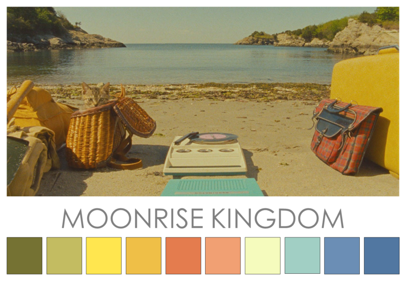
Moonrise Kingdom (2012) Wes Anderson is renowned for his use of controlled colour palettes and this is evident in Moonrise Kingdom. In this film, the colour palette features faded versions of bright colours, particularly red and yellow plus green and blue. This colour palette is reminiscent of a 1950s summer holiday and the handmade aesthetic of that era. In this way, the colour palette represents the tender innocence of first love. The film revolves around two pairs of contrasting colours: red-green and blue-yellow/orange. These contrasts serve to symbolise the coming-of-age theme and the disparity between the two main characters and their respective families and guardians. While tonal values vary and include a strong light-dark contrast, the film predominantly features a minor tonal value chord of faded hues hovering around the mid tonal level range. Check it out – Instagram @cinema.palettes
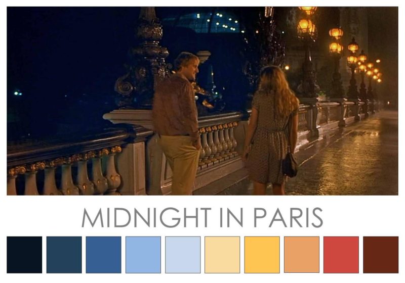
Midnight in Paris (2011). Woody Allen’s film is set in the City of Light and has two distinct colour palettes. The first features brighter, lighter hues and relatively strong light-dark contrast for the scenes set in the present. In contrast, the ‘after midnight’ scenes feature a sepia-infused palette of warm, rich reds and golden hues enhanced by velvety midnight blue hues. This second palette glows with warm, intense colours and a darker, low key light-dark tonal chord. As the narrative draws to a close, this second colour palette also features in the final scene of the film. Set in the present, this scene features the possible beginnings of a new romance for the main character and is set on the Pont Alexandre III, a bridge that spans the Seine River. The ‘after midnight’ colour palette in this scene, the symbolism of a bridge plus its romantic Art Nouveau details create a new sparkline in the narrative. These visual cues reflect our collective desire for love and reinforce the magic of the film. Check it out – Instagram @cinema.palettes
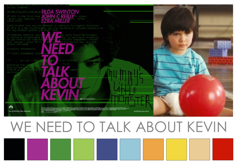
We Need to Talk About Kevin (2011) Directed by Lynne Ramsay, this drama features a particularly interesting use of colour. Red features in multiples scenes, symbolising bloodshed and danger. In addition, the colours of an apparently happy, all-America home (saturated yellows, blues, reds and greens) feature in selected scenes such as the kitchen scenes. These bright, cheerful “normal” colours are often contrasted against muted toned background colours. This colour strategy sets up a visual contrast that ties in with the film’s unsettling narrative. Some theorists have suggested that the use of red and yellow represent blood and bile, and the fragility of the human organism. Strong light-dark contrast features throughout the film and this seems to reinforce a good vs. bad dynamic within and between the main characters. One of the film’s posters features a highly unusual colour scheme of pink/purple against a lime green and black background. This unusual pair of contrasting colours is used strategically to convey an unsettling vibe centered around the main character, Kevin. Check it out – Instagram @cinema.palettes
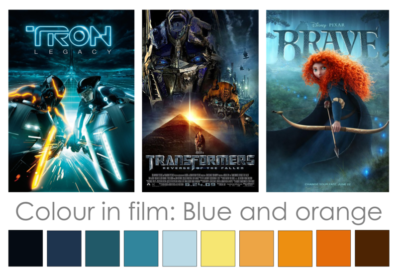
Blue and orange in film. The trend to use blue and orange in film has become more and more apparent almost to the point of over-use. This pair of contrasting colours is used strategically for a couple of reasons. Firstly, the warm, orange tones make the actors appear to visually ‘pop’ against the background bringing them more strongly into focus. Secondly, this use of contrasting colours sets up a visual opposition effect that ties in with the film’s narrative and helps to reinforce character development. The use of contrasting blue and orange is particularly noticeable in the films Tron Legacy (2009), Transformers 2 (2010) and Brave (2012). Check it out – Instagram @cinema.palettes For more on this strategy, check out this video at YouTube.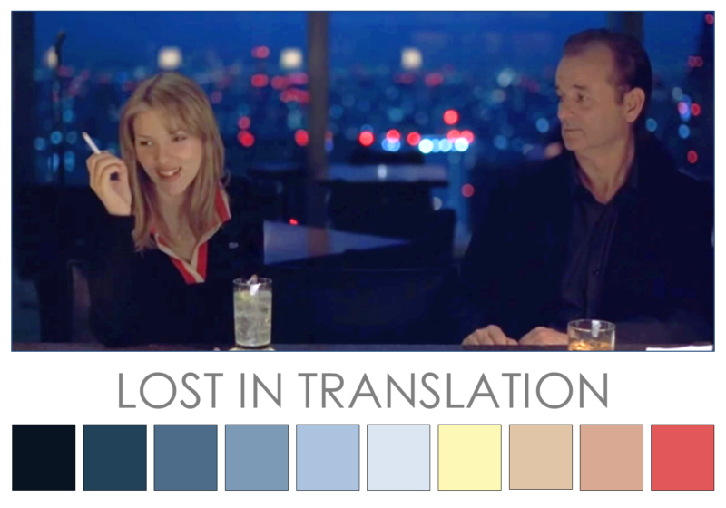
Lost in Translation (2003) This film features chiaroscuro (strong light-dark contrast) to underscore the film’s theme and narrative. Director Sofia Coppola’s film features a predominantly minor tonal value chord of mid to dark blues. This film colour palette highlights and symbolises the loneliness and despondency of the two main characters. Blue is often associated with feelings of loneliness. The darker tones of blue reflect and reinforce a sense of isolation especially late at night. The film is awash with blue tones and hence the viewer is drawn to warm tones of red, orange and yellow when they appear. These lighter, warmer hues tend to symbolize a respite to the loneliness and despondency of the key characters. That is, they symbolise small beacons of hope, romance and humour that seem to hover just out of reach of the main characters throughout the film.
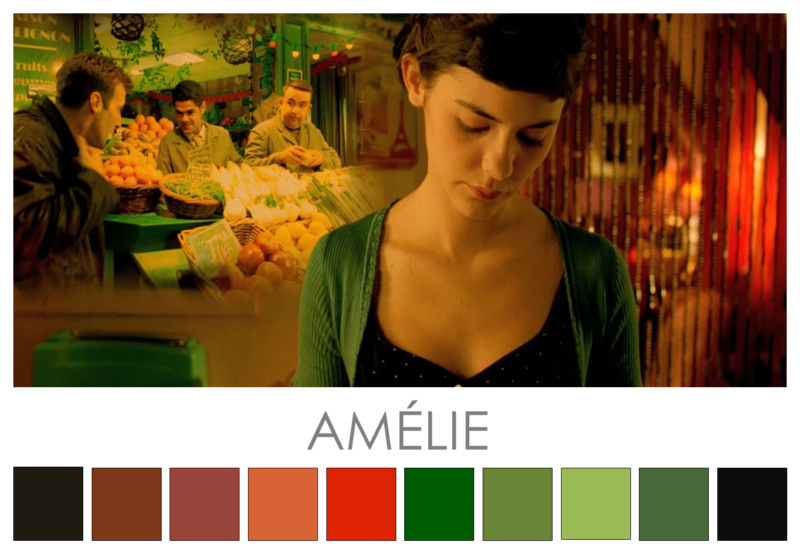
Amélie (2001) Jean-Pierre Jeunet’s film features an intense red-green contrast. In some scenes, red-green is muted while in others, Jeunet has strategically enhanced the red-green contrast. Jeunet used a digital technique (Digital Intermediate) to manipulate specific colours (especially reds and greens) and increase their saturation in particular scenes. This saturated red-green contrast highlights and reinforces the emotional nature, tribulations and longing of the central character. Blue-gold features as auxiliary contrasting colours act as a visual signal and also respite for the red-green contrast. Colours and colour contrasts are used throughout the film to attract attention, create focus and support character and narrative development. The major tonal value chord and contrasting colours visually convey mood and ambience. Check it out at Instagram @cinema.palettes
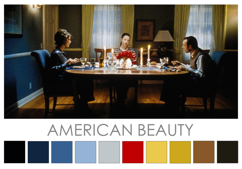
American Beauty (1999) Saturated red features in every key scene of Sam Mendes’ film as either a central or secondary detail. In the film, red signifies vitality, passion, danger and death depending on context. In the scene below, red serves as a danger signal to highlight tensions within the family and within each of the characters. Each character yearns for something more, some intensity and passion that they feel is lacking. Red simultaneously signals the dangers of moving out of one’s comfort zone and also symbolises that which is yearned for and desired. Strong contrasts (light-dark, warm-cool and blue-yellow/orange) enrich the film’s colour palette. These contrasts and the continuous occurrence of red create focus and convey mood and ambience, plus support character and narrative development.
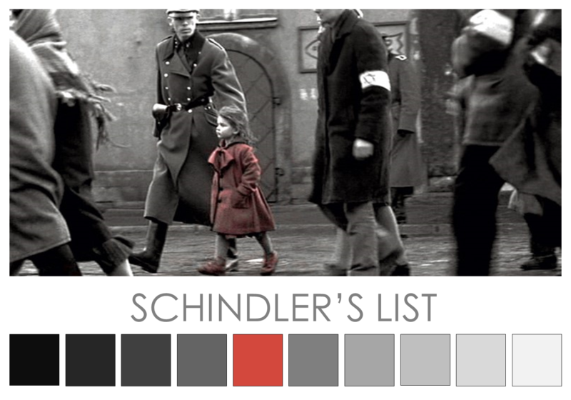
Schindler’s List (1993) The short opening scene is full colour; however, colour drains as the film begins to show us the harsh realities of Nazi Germany. The colour (red) often associated with wartime slaughter is absent due to the film’s black/white aesthetic. Steven Spielberg uses a major tonal value chord to highlight the grim life-or-death narrative. The lack of colour represents a view of an unreal world that lacks humanity. Strong light-dark contrasts bring into focus the nightmarish realities of the Gestapo during WWII. Against the black and white aesthetic of the film, the red of a young girl’s coat serves as a small, silent yet stark contrast. The viewer is drawn to the only hint of colour throughout the body of the film. Red in this context attracts attention, creates focus and serves as a visual signifier. As we watch the film, we realise that the red coat is a symbol of lost innocence, the futile struggle of humanity against overwhelming tyranny and oppression, and the tragedy of indiscriminate slaughter.
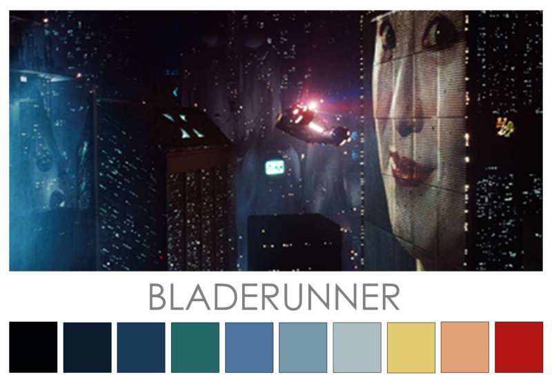
Bladerunner (1982). Ridley Scott’s cult classic features a neo noir (tech noir) film colour palette. Inspired by the classic film noir high contrast black and white Low Major Tonal chord, Bladerunner features the same high contrast Low major tonal chord in saturated and desaturated blues, blue/greys and the occasional sea green. The strong, dark-hued contrasts that pervade the film reflect not only the danger and paranoia of the narrative but also the shadowy moral outlook of key characters. The implications of pervasive technology feature in the flood-like reference to Noah’s ark via the almost constant rain and pervasive blues. The predominantly blue palette is contrasted with flashes of warm hues. This warm-cool colour contrast ties in with the film’s themes and narrative by highlighting the contrast between replicants and humans in a dystopian Los Angeles. Scott credits Edward Hoppers
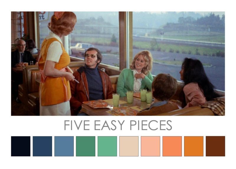
Five Easy Pieces (1970). Directed by Bob Rafelson, this was Jack Nicholson’s break through film. Once a piano prodigy, Nicholson’s Bobby Dupea is stuck between two worlds: his priviledged background and his current reality as a blue-collar worker in the Californian oilfields. The simmering tensions between these two worlds is reflected in the colour palette of the film which features the broad contrast of blue and orange throughout. Clean hues of peach and orange contrast with greyed blues and greens representing the social divide between the cast of characters. Strong light-dark contrast throughout the film reinforces this effect. Check it out – Instagram @cinema.palettes
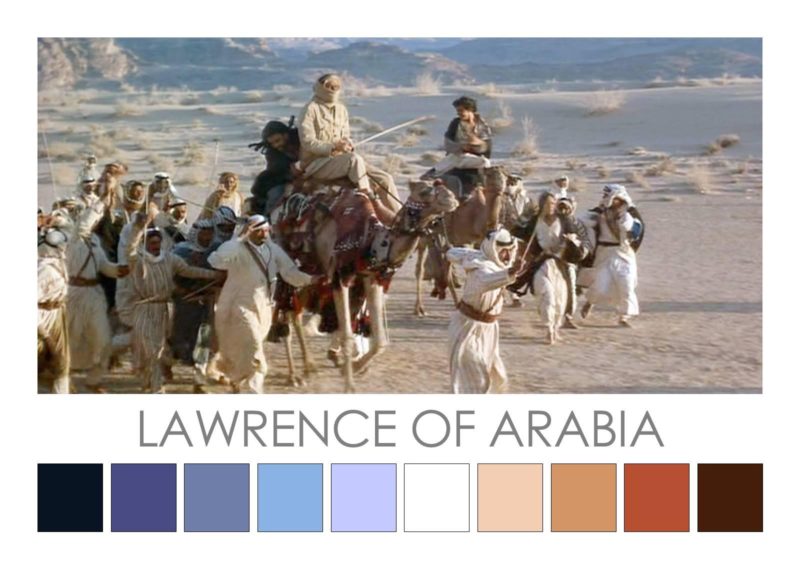
Lawrence of Arabia (1962). Nominated for 10 and winner of 7 Academy Awards, David Lean’s epic historical drama features desert scenes shot in Jordan and Morocco. Much of the film features a palette of light toned, warm hues drawn from the colours of sand and sandstone. These contrast against the oasis colours of blue water, blue sky and mauve blues of distant mountain ranges. These light, warm colours are also reflected in the sitting rooms, uniforms and paraphernalia of the English; while the darker blues are reflected in the robes of the Arabs, and especially those of Auda abu Tayi. The film features a high key light-dark contrast that is seen to its best advantage in the fictionalised attack on Aqaba which featured white-washed buildings set on a sandy plain on the edge of the sea. This light-dark contrast is also reflected in the disparate cultures and notable figures around which the historical drama revolves: Peter O’Toole’s golden-haired, pale-skinned depiction of T.E. Lawrence contrasts sharply with key Arab figures including Omar Sharif’s Sherif Ali; Anthony Quin’s Auda abu Tayi, and Alec Guinness’ Prince Faisal. The film won Best Picture, Best Director, Best Original Score, Best Cinematography (Color), Best Art Direction (Color), Best Film Editing and Best Sound Mixing. Check it out at Instagram @cinema.palettes
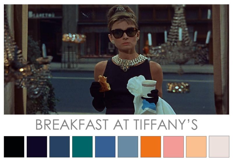
Breakfast at Tiffany’s (1961) Blake Edward’s classic romantic comedy features Audrey Hepburn in her iconic role as Holly Golightly in the cinematic production of Truman Capote’s novella. The film is set against a background colour palette of steel greys and blues drawn from the streetscape of New York. Aside from Hepburn’s little black dresses designed by Givenchy, Hepburn also wears saturated orange and pastel pink throughout the film. These warm colours, along with Hepburn’s peach-coloured complextion perfectly enhanced with pearl necklace, serve as a stunning contrast to the cool colours of the city background. This contrast pairing of warm and cool colours support and reinforce the liberated ‘free-spirit’ character. Capote colour-infused description: “It was a warm evening, nearly summer, and she wore a slim cool black dress, black sandals, a pearl choker. For all her chic thinness, she had an almost breakfast-cereal air of health, a soap and lemon cleanness, a rough pink darkening in the cheeks.”
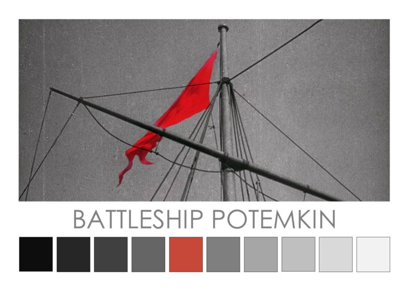
Battleship Potemkin (1925). Sergei Eisenstein’s classic silent film is pure propaganda disguised within the film narrative about a mutiny. An early example of symbolic colour in a black and white film, Eisenstein used a white flag during filming. The white flag raised on the battleship was later hand-coloured red during post-production. Testing his theories about montage, Eisenstein used multiple visual signifiers to generate sympathy for the mutineers and in turn, reinforce his propaganda. Raising the red flag and coupling this overt signal with the massacre, horrors and injustices suffered by the populace, imbues a powerful, rallying signal in the red flag akin to the way in which red came to symbolize revolution within the context of Communist Revolution. Check it out – Instagram @cinema.palettes
Instagram @cinema.palettes – feel free to repost images but please credit © Zena O’Connor.
Hi, I just saw The Revenant and it seemed like color played an important role, I’m just not sure how. Could you do a color analysis for that film sometime please?
Author
Hi Max, thanks for your comment. I’ll put up the film colour analysis soon. Cheers, Zena
Author
Check out the colour analysis for The Revenant – keen to hear what you think.
These are great film color palettes! They really illustrate how the directors have specifically used color in their films.
Author
Thanks Sarah. There’ll be more of these film colour palettes going up soon.
A wonderful range of palettes and emotions contributing to the storytelling in these films. Fabulous inspiring article.
Author
Thanks Peter!