I’m very chuffed to have provided Steve Tidball of Vollebak UK with some evidence-based high visibility colour insight.
London-based start-up Vollebak is a cutting edge, experimental adventure brand that creates adventure sports clothing using insights and discoveries from diverse fields such as neuroscience, physiology, material technology and space exploration…and evidence-based colour research.
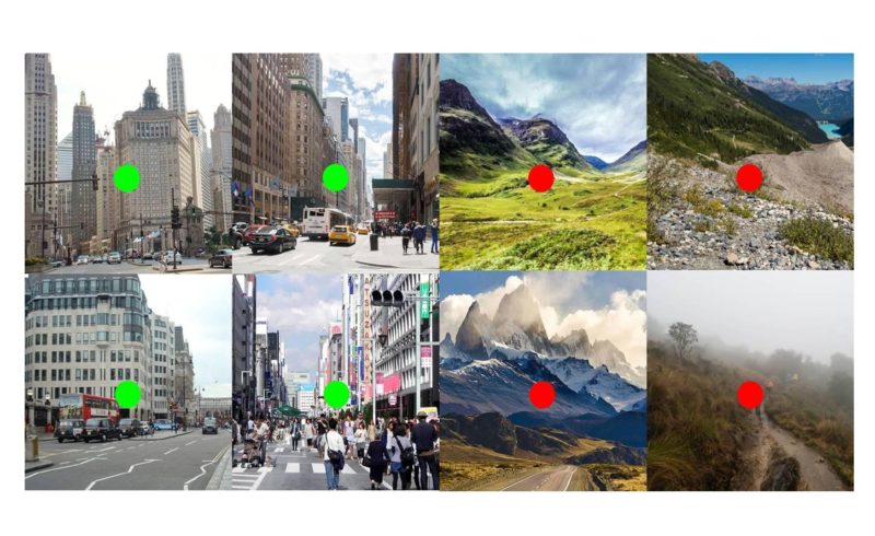
Vollebak released High Visibility Nano 555 in 2017, which is ideal for urban environments. Its bright green contrasts and visually stands out amongst contextual colour in these environments. Nano 555 is highly visible when there is a preponderance of varying or contrasting hues such as blues, greys, browns plus reds in terms of stone, asphalt, signage, etc.
For rural environments and trekking or hiking, I recommended Nano 640 (bright scarlet red) which is highly visible in these environments because of the relative lack of bright red objects. Bright scarlet red contrasts with the green and blue hues of a rural landscape – green foliage, brown/blue stone, brown/green trees, blue rivers/sky, grey mist and fog, etc. Bright scarlet red is a highly visible colour at sea and especially in fog and mist, and has traditionally been used for this reason in lighthouses for centuries. In addition, bright red has attentional advantage. That is, we are hard-wired to notice bright red due to it’s link with blood, danger, etc.
High visibility colour represents a disruptive colour relative to surrounding colour. The effectiveness of disruption relies on strong hue, saturation and tonal value contrast between object colour and contextual colour.
To find out more about Vollebak, click this link.