A recent project highlighted an issue that can occur with ‘Heritage’ color scheme specification. This issue revolves around errors in identifying building style, which can lead to specifying inappropriate exterior façade colors. While this is not a common pitfall, it is one that can result in visual incongruence wherein colors and architectural styles may appear jumbled and discordant.
This recent example involved a 1990s townhouse complex in Melbourne that was mistakenly identified as Federation. However, the townhouses featured design and construction materials common to the 1990s: red brick walls, terracotta red roof, and light-colored off-white, powder-coated aluminum window frames and timber door trims. Aside from these typical 1990s details, the townhouses featured faux gable roofs which included fascia and bargeboards. These details mimicked Federation style and hence, the townhouses represented an example of Federation Revival style.
An issue arose when the color consultant erroneously identified the townhouses as Federation style based on the gable roof details and then proceeded to specify Victorian heritage colors for the exterior façade. The result was a dissonant intermingling of 1990s architecture with Victorian façade colors. Due to the contrasting hues and tonal values that were specified, the color scheme served to highlight the faux Federation architectural details.
Another key issue with the project was that the client brief called for an exterior façade color scheme that modernized the townhouse complex prior to putting the entire complex up for sale. Hence, the outcome was also far from the client brief.
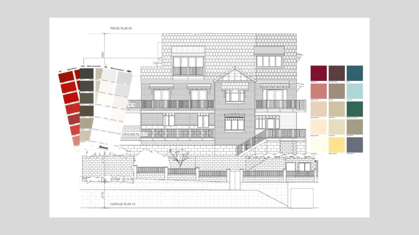
To resolve the project in a way that met the client brief, it was recommended that exterior façade colors were not drawn from any kind of Heritage color palette. Instead, a ‘New Neutrals’ was proposed as this approach allocates similarity of tonal values to minimize the unwanted faux Federation architectural details which dated the overall appearance. Darker contrasting tonal values and pops of color (not Heritage colors!) were recommended to highlight other architectural details in a way that modernizes the townhouses.
The New Neutrals color strategy features a major chord of tonal values – that is, light tones plus mid tones plus dark tonal values. Applying tonal values in a major chords adds a clearly defined crispness and conveys a sense of freshness and modernity.