I provide evidence-based facade colour reports for clients as requested. These reports are include colour scheme options for private residences, apartment buildings and commercial buildings. In addition, I include information about local government facade colour regulations and planning policy plus Heritage Office recommendations where relevant.
My facade colour reports are detailed and always include multiple colour scheme options. The reports also address issues relevant to local planning policy, which can be quite vague in relation to notions like ‘colour harmony’ and ‘compatible colour’. Planning policy often assumes universal responses to colour with colour harmony underpinned by hue similarity.
However, ideas about colour harmony are quite diverse. Some people align colour harmony with hue similarity while others with contrasting hues.
In 2006, I published a peer reviewed paper: ‘Bridging the gap: Facade colour, aesthetic response and planning policy’. This paper was published in the prestigious Journal of Urban Design and came out of my PhD research. My research findings indicated that planning policy was not always keeping abreast with emerging ideas about facade colour. Planning policy often mentions terms like ‘harmonious colours’ and ‘compatible colours’. However, the definitions of these are often absent from planning policy. In addition, definitions of these terms vary due to a range of factors including context as well as cultural differences.
The paper, which won a University of Sydney Research prize, is available from my profile page at Academia.edu.
You can also check out the paper at the Journal of Urban Design website.
The full reference is: ‘Bridging the gap: Facade colour, aesthetic response and planning policy’. Journal of Urban Design, 11 (3), pp335-345.
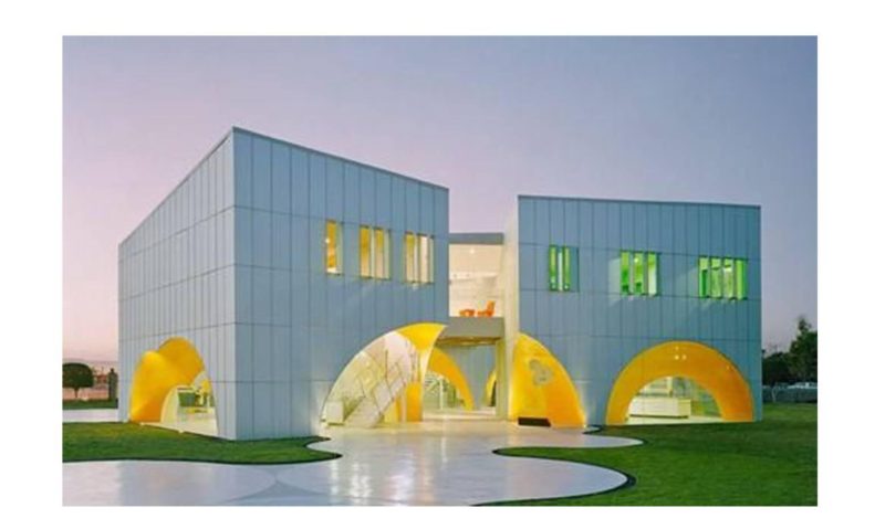
The image in this post is the Nestle laboratory by Rojkind Arquitectos in the city of Querétaro (2007).
