Supergraphics for Cyclist • Pedestrian Shared Zones
In most local government areas, cyclists must dismount and walk, not ride, across pedestrian crossings or slow down to 10km per hour in pedestrian plazas and keep 1m distance from pedestriands. These regulations are intended to minimise risk to cyclists and pedestrians and lower the likelihood of accidents.
This proposed project for Sydney Council introduces Disruptive Colour Supergraphics across pedestrian plazas as a way of achieving two main aims:
- Provide a strong visual cue that alerts cyclists to the presence of pedestrian zones which in turn encourages them to dismount.
- Decrease pedestrian casualties by minimising the occurrence of cyclist/pedestrian accidents.
Background statistics
Pedestrian casualties continue to occur and in CBD locations like Sydney and North Sydney, pedestrians made up 16.5% of all casualties and were involved in 7.5% of all crashes in 2014. The age groups with the highest casualties are as follows: 0-16 years old – 17 casualties; 21-25 years old – 20 casualties; 26-29 years old – 22 casualties; 30-39 years old – 23 casualties; 50-59 years old – 19 casualties.
In 2014 there were 158 pedestrian casualties across 10 northern Sydney council areas.
The Centre for Road Safety statistics noted incidents occasioning death or injury to pedestrians reached 563 in Metropolitan areas of New South Wales in 2015; while incidents occasioning death or injury reached 120 in country NSW.
While crashes involving pedestrians were lower than in 2013, the increasing and prevalent use of smartphones is likely to add to pedestrian casualties on an ongoing basis. This is made more complex by the apparent reluctance of cyclists to dismount when they enter pedestrian zones.
Disruptive Colour Supergraphics – Rationale and Research
Disruptive Colour Supergraphics involves using saturated, contrasting colours coupled with white Resene FX Nightlight paint that glows in the dark.
The evidence-based rationale behind Disruptive Colour Supergraphics is that strong, contrasting colours and patterns attract attention, encourage engagement and, due to their atypical disruptive nature, create a visual alert for pedestrians, drivers and cyclists alike.
Research indicates that human direct and peripheral attention is drawn to strong contrast and movement. Specifically, during normal vision, the human eye makes many micro movements when scanning a scene or performing an activity. Known as saccades, it’s estimated that the eye makes about three scanning movements per second. But what catches the attention of a saccade? Contrast and movement are key predictor variables in visual detection (McPeek, Maljkovic, & Nakayama, 1999; Shang & Bishop, 2000).
In addition, Fixational Reflex is the tendency for the human eye to notice and focus on an object that is bright relative to its surroundings (Boynton, 1979). Fixational Reflex is often referred to as the Isolation Effect in applied design and the built environment, and supports Intuitive Design (Universal Design). The Isolation Effect (also known as the von Restorff effect) occurs when an object or text contrasts strongly with its surroundings in hue, saturation or tonal value, making the object or text appear significant (Van Dam, Peeck, Brinkerink, & Gorter, 1974). The Isolation Effect is used to draw attention to specific design elements by strategically using colour/contrast strategies for Call-to-Action links, product controls, key details in the built environment such as exit doors, as per the following image of the Melbourne Convention Centre, Woods Bagot (2010).
Supergraphics Colour/Designs for Cyclist Dismount Zones
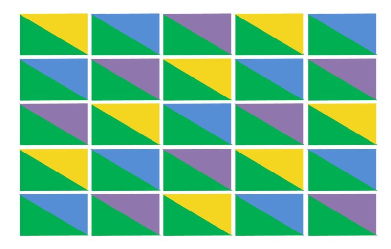
These supergraphic designs feature strong colour/contrast colours, dynamic diagonal design elements coupled with white stripes painted with Resene FX Nightlight, a waterborne glow in the dark paint.
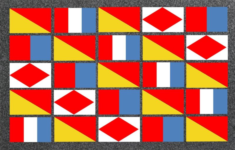
The following design incorporates International Maritime Signal flags that have been used since the 1850s as a successful form of visual communication in International waters. Specific flag designs have been incorporated including: D Delta ‘Keep clear of me, I am maneuvering with difficulty’; E Echo ‘I am altering my course to port’; F Foxtrot ‘I am disabled’; I India ‘I am altering my course to starboard’; O Oscar ‘Man overboard’; and T Tango ‘Do not pass ahead of me’.
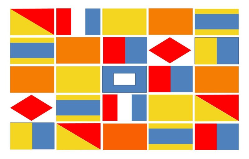
The following Supergraphics design features strong contrasting colours, dynamic diagonal design elements coupled with white stripes painted with Resene FX Nightlight, a waterborne glow in the dark paint.
References
Boynton, R.M. (1979). Human color vision. New York: Holt, Reinhart & Winston.
McPeek, R.M., Maljkovic, V., & Nakayama, K. (1999). Saccades require focal attention and are facilitated by a short-term memory system. Vision Research, 39(8), 1555-1566.
O’Connor, Z. (2013). Colour, contrast and Gestalt theories of perception: The impact on visual communications design. Color Research and Application, 40 (1), 85-92.
O’Connor, Z. (2016). Colour/Contrast Strategies to Improve Environmental Visual Literacy, Universal design Symposium, ANZ Viaducts Centre, Auckland.
Shang, H, & Bishop, I.D. (2000). Visual thresholds for detection, recognition and visual impact in landscape settings. Journal of Environmental Psychology, 20(4), 125-140.
Van Dam, G, Peeck, J, Brinkerink, M, & Gorter, U. (1974). The isolation effect in free recall and recognition. The American Journal of Psychology, 87(3), 497-504.
Road Safety statistics and information:
http://roadsafety.transport.nsw.gov.au/statistics/interactivecrashstats/index.html
http://www.dailymail.co.uk/news/article-4194196/One-crash-day-involving-cyclists-pedestrians.html
