Colour schemes for older apartments and heritage buildings depend on a number of key issues including:
- Architectural style and fixed heritage design details
- Directional aspect and amount of natural light
- Client preferences, artwork and furniture
For an interior that has dominant heritage design details such as timber trim and panelling, a neutral paint colour can provide a visually cohesive element that can anchor the overall scheme and provide a visual structure for colour accents, auxiliary colours, furniture, furnishings and artwork.
As a guide, use neutral colours that have undertones that link hue-wise with heritage design details. All neutrals colours have a warm or cool undertone as well as undertones that may be any of the key hues: red, orange, yellow, green, blue, purple, brown and grey.
Directional aspect as well as the number and size of windows influences the amount of natural light flooding into an interior. North-east aspect allows for the greatest amount of natural light (in the southern hemisphere). South aspect means less natual light and western aspect often means afternoon sun.
Window size also varies with heritage buildings with some buildings enoying plenty of large windows that allow for abundant natural light. Other heritage buildings have smaller and fewer windows, leaving interior spaces relatively darker and duller.
Kirribilli residence, 2015
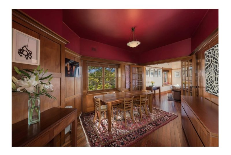
The architectural style of this 1927 apartment in ‘Rockcliff Mansions’ featured Georgian proportions and design details including timber panelling plus timber door and window frames throughout. The mid-tone, warm honey colour of the Queensland maple timber panelling and trim details plus the Jarrah floors were a strong feature and the proposed colour scheme needed to be compatible with this dominant design element.
The directional aspect of the apartment was north/east. With its large windows and 180 degree harbour views, the apartment was flooded with natural light in all seasons. This meant that marginally deeper, darker hues could be specified as these would appear slightly lighter and brighter when applied.
The client’s art collection included a black and white Emily Kame Kngwarreye painting, a number of colourful works by Martin Sharp and Adrienne Doig, etchings by Brian Dunlop, John Firth-Smith and Imants Tillers plus a collection of antique Japanese woodblock prints. The diverse colours featured in these works allowed for stronger colours to be specified, which would enhance but not distract from the artworks.
The client’s preferences included a dining room that was dramatic and unique. This particular room had plenty of natural light allowing for the client’s preference of a relatively strong red ceiling and wall (above the timber panelling). The client’s daughter also wanted a blue bedroom and a hue was chosen that reflected the colours of the harbour and Jacaranda trees that could be seen from every window in the apartment. Both hues were specified at a mid-tonal level to be visually cohesive with the timber panelling and design details.
Resene Lumbersider paints were specified throughout. This paint is environmentally sustainable, durable and available in hues that were compatible with the heritage design details of the apartment.
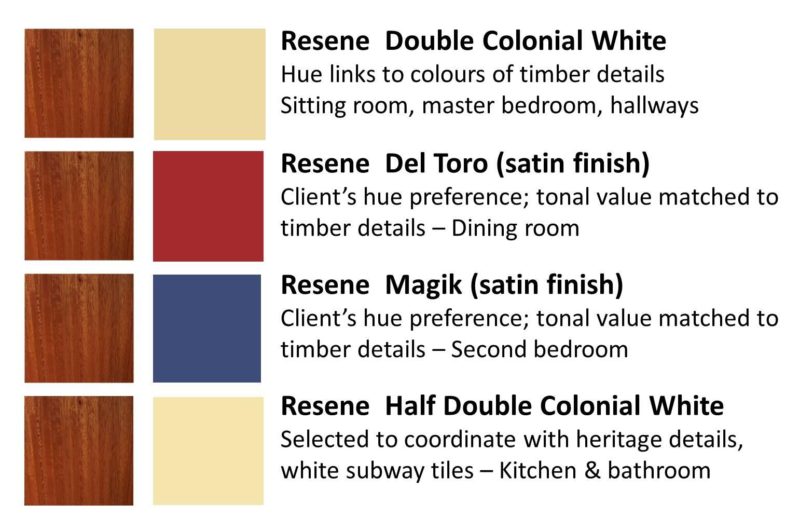
Resene Double Colonial White (Y85-054-085) was specified as the neutral colour throughout the apartment as this neutral has a yellow, soft ochre undertone and this complemented the honey tones of the timber panelling and created a visually cohesive element that underpinned the accent colours and the client’s artworks. Flat was specified for the sitting room and satin finish for the other areas as the sitting room enjoyed plenty of strong light.
Resene Del Toro (R46-119-032) was the client’s preferred red for the dining room. Resene Magik (B45-066-273) was the client’s preferred blue for the second bedroom.

This colour scheme looks great! It really suits the old school details like the wood panelling plus the contemporary artwork.
Author
Hi Sarah, glad you like it!