My peer-reviewed paper ‘Colour Harmony Revisited’ was prompted by a new approach to the notion of colour harmony. Previous theorists often presented a prescriptive approach to colour harmony. That is, if you follow specific rules or guidelines, you will achieve colour harmony irrespective of context or audience.
My approach assumed that perceptions of colour harmony would change according to a range of factors including individual differences, cultural variation as well as perceptual, contextual and temporal factors. I presented a new diagrammatic model to reflect this somewhat more complex approach to colour harmony.
You can check out the paper at my profile page on Academia.edu.
And you can also check out the paper at the journal Color Research and Application.
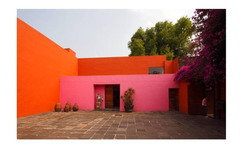
The image featured is La Cuadra San Cristobal horse ranch by Luis Barragán (1902-1988). The architecture of Pritzker Prize-winning Mexican architect Barragán features a colour palette that includes saturated orange, pink, red, purple and yellow. These colours are offset by white walls and the colours of nature also play a key role especially blue and green. Barragán’s architecture challenges conventional notions about colour harmony.
