INTERIOR magazine asked me to review the colour scheme of the unique CIGA project in Christchurch, New Zealand.
The Christchurch Integrated Government Accommodation (CIGA) will eventually see approx. 1700 government employees from up to 20 government agencies return to the Christchurch CBD in four new purpose build tenancies.
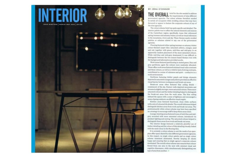
A site visit revealed that this unique project houses nine separate government agencies, each of which has its own corporate colours. The guiding aim of the interior colour scheme was to use colours that identified different work areas while not appearing to favour the corporate colours of any one of the nine government agencies.
The solution was to use an interior colour scheme inspired by the colours of nature. A colour-coded approach was used to differentiate spaces: collaborative work areas, quiet work areas, meeting rooms plus a shared public reception and large staff hub.
A key aim of the design was to encourage effective but not disruptive interaction of staff from different agencies and to maximise the potential benefits of collocation. During my site visit, I saw this working first hand, with different government agencies cohabiting the space with ease and minimal interruption. Indications are that staff respected the protocols of quiet work areas and collaborative work spaces.
The main client for the CIGA project was Statistics New Zealand the design firm was Pelorus Architecture. For more information about the project, go to their website.

Hi Zena
Thanks for your comments on this project – we were very pleased with the result.
Kind Regards
Allan Collins
Pelorus Architecture
Author
Hi Allan, thanks for your message. The colour scheme was very effective, especially given the contraints of the project. Kind regards, Zena