My consultancy work often involves evidence-based interior colour scheme strategies for private and corporate clients.
Responses to colour are subjective and idiographic, so I always start with the client’s preferences in art and furniture, and then devise colour scheme options based on a tonal chord that will enhance the space and suit the client’s interior design objectives.
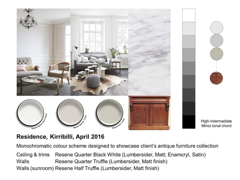
Residence, Kirribilli 2016
The above image features an interior scheme for a magnificent three-storey Victorian house in Kirribilli, Sydney. Warm greys were a colour preference for the clients and this scheme was designed to showcase their collection of antique furniture and objects d’art. A predominantly High-Intermediate Minor tonal chord was used in this interior scheme and this resulted in a calm, welcoming ambience.
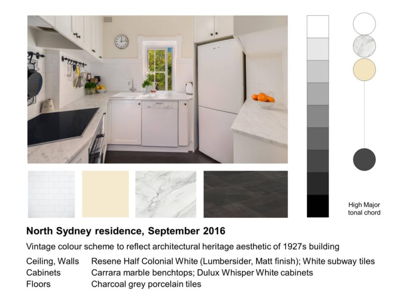
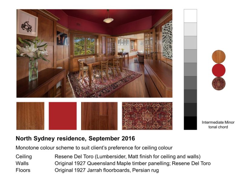
Residence, North Sydney 2016
The following images feature the dining room and kitchen in a 1927 apartment building. The colours and finishes for the kitchen reflected the Georgian vintage aesthetic of the building. A High Major tonal chord with light hues coupled with a charcoal floor and black design details added an energised feel to the space and a fresh, updated ambience while still honouring the architectural style of the apartment.

The client requested a red ceiling in the dining room to complement the Georgian Queensland maple timber panelling and Jarrah floors. A red hue was selected that matched the tonal value of the timber panelling. This resulted in a Minor tonal chord ensuring that the red ceiling was a feature without dominating the space. The Minor tonal chord also gave the space a warm, cocoon-like ambience that the clients found conducive to entertaining.

Interior colour scheme strategies