This meeting report focused on papers presented at the AIC Study Group on Environmental Colour Design at the International Colour Association conference in 2021.
My paper focused on variations between specified colour and perceived colour: ‘Specified colour vs. perceived colour: Identifying and managing factors that impact colour in the built environment’
The paper discussed the challenges facing architects and designers when using colour in the built environment. Many of these challenges arise due to variation between specified colour and the resulting perceived colour when specified colour is applied in situ.
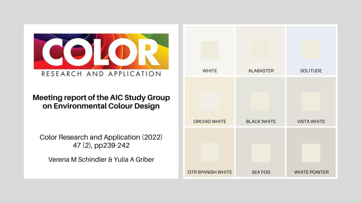
One of the reasons for variation between specified colour and perceived colour arises due to the occurrence of simultaneous contrast within the context of paint colour in interior colour design or exterior façade colour. In the illustration, the grid features Resene Paint’s Rice Cake colour at the centre of each square surrounded by nine different white paint colours. Depending on the contextual colour in each grid square, Rice Cake appears to vary marginally in colour attributes, especially hue and tonal value.
I have been a member of the AIC Study Group on Environmental Color Design since AIC 2009 when I presented the paper ‘Façade colour and judgements about building size’. This paper represented a small section of my PhD research: ‘ Façade colour and aesthetic response: Examining patterns of response within the context of urban design and planning policy in Sydney’ (2008).
The abstract for the paper was published in the 2021 AIC Conference, Milan Abstracts – follow this link.