This project involved developing an array of packaging colours for an Australian-based travel skincare startup, In-Flight Magic due to launch in March 2019.
An interesting project, the client required packaging colours that represented both product ingredient attributes and also appealed to the target market. However, from prior experience I know this is problematic because of the competing aims which are not always convergent. That is, it can be difficult to achieve both aims without making some compromises.
Colour Mapping Study – Packaging Colours
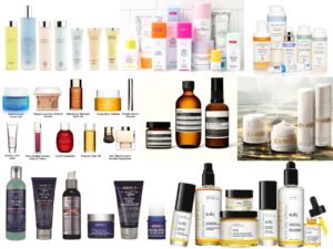
For this project, I conducted a colour mapping study of the packaging colours of leading brands in the skincare category. This included well-established brands to newly launched brands. The diversity in this category is broad and includes brands like Aesop, Clarins, Suki, Rens, Clinique through to newer brands like Drunk Elephant.
Some skincare brands aim to use packaging colours that represent product ingredients. Brands like Aesop and La Mer use standardised packaging and brand colours that focus on brand recognition. Brands like Clarins and Ren use a range of colour tints as well as saturated colours.
Packaging Colours – Rationale
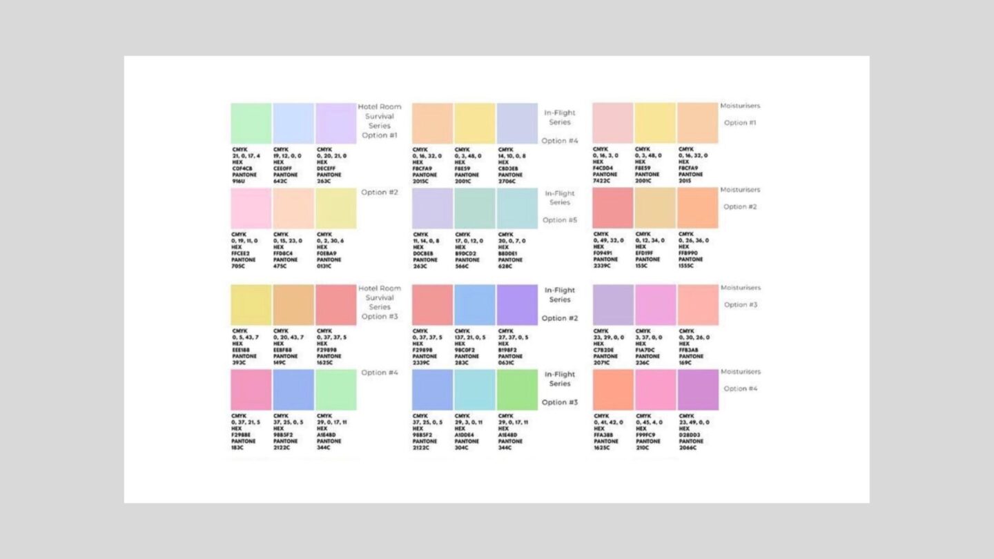
I opted for a different approach for the colour develeopment process. Specifically, I used all three attributes of colour to create visual differentiation. The client wanted visual differentiation within the product range as well as in respect to competitor’s packaging and brand colours.
For this project, I used packaging colour clusters or hue families that featured similarity of saturation and tonal. This created visual differentiation while also ensuring visual cohesion.
Colour/contrast played a key role because its a key element that contributes to effective visual literacy and can help attract attention and engage the target market.
The idea of using colours that appeal to the target market can be a problemtic approach. Responses to colour are a moveable feast. Colours that may appeal to a particular market segment today will change in line with evolving colour trends and fashion colours. Ideally, a new brand should conduct some form of research to ascertain the appeal of skincare packaging colours among the target market. This is an important step for a marketer as a means of avoiding personal preferences when selecting packaging or brand colours.
Another option is to allow packaging colours to be flexible and have the capacity to change over time. This will address the issue of changing colour preferences among the target market.
Competitors product packaging colours