There are a number of goals that can be achieved with façade colour beyond aesthetics.
Located in Sydney’s Bellevue Hill, this property featured a Minimalist architectural style that was partially obscured by added details such as external window shades, first floor balcony railings and a colour scheme that was out of character with the property.
The clients required a refresh of the exterior and a façade colour scheme that enhanced the property’s architectural style.
In addition to the main aim of the project, two key issues informed façade colour design development:
- The colours of existing fixed features such as garage roller door, main entrance front doors, guttering, roofing, and marble paving are to remain the same.
- The colour scheme to extend to the street-facing garage and front fence.
The proposed development of alternative façade colour options acknowledged the existing colours of key details such as the front door and garage door (dark charcoal black – Colorbond Monument, Ironstone or similar), window frames (brushed aluminum), first floor railings (black) and front fence (currently Resene, Magma).
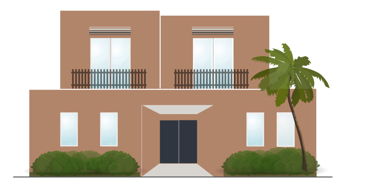
The property’s original façade colour scheme featured a muted terracotta plus black powder-coated balcony railings and first floor window shades, both of which attracted attention away from the clean lines of the property’s architectural style thereby making the property appear dated as per Figure 2.

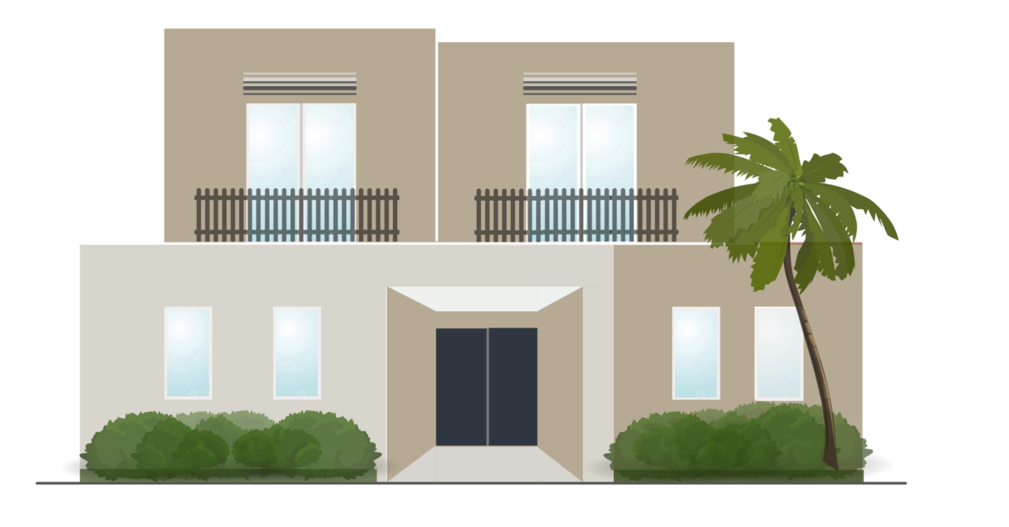
The clients updated the façade colour scheme replacing muted terracotta with sandy beige and off-white but retaining the black powder-coated balcony railings and first floor window shades. The colour scheme was an improvement; however, the property still appeared dated and the scheme did not enhance the property’s architectural style – see Figure 3.

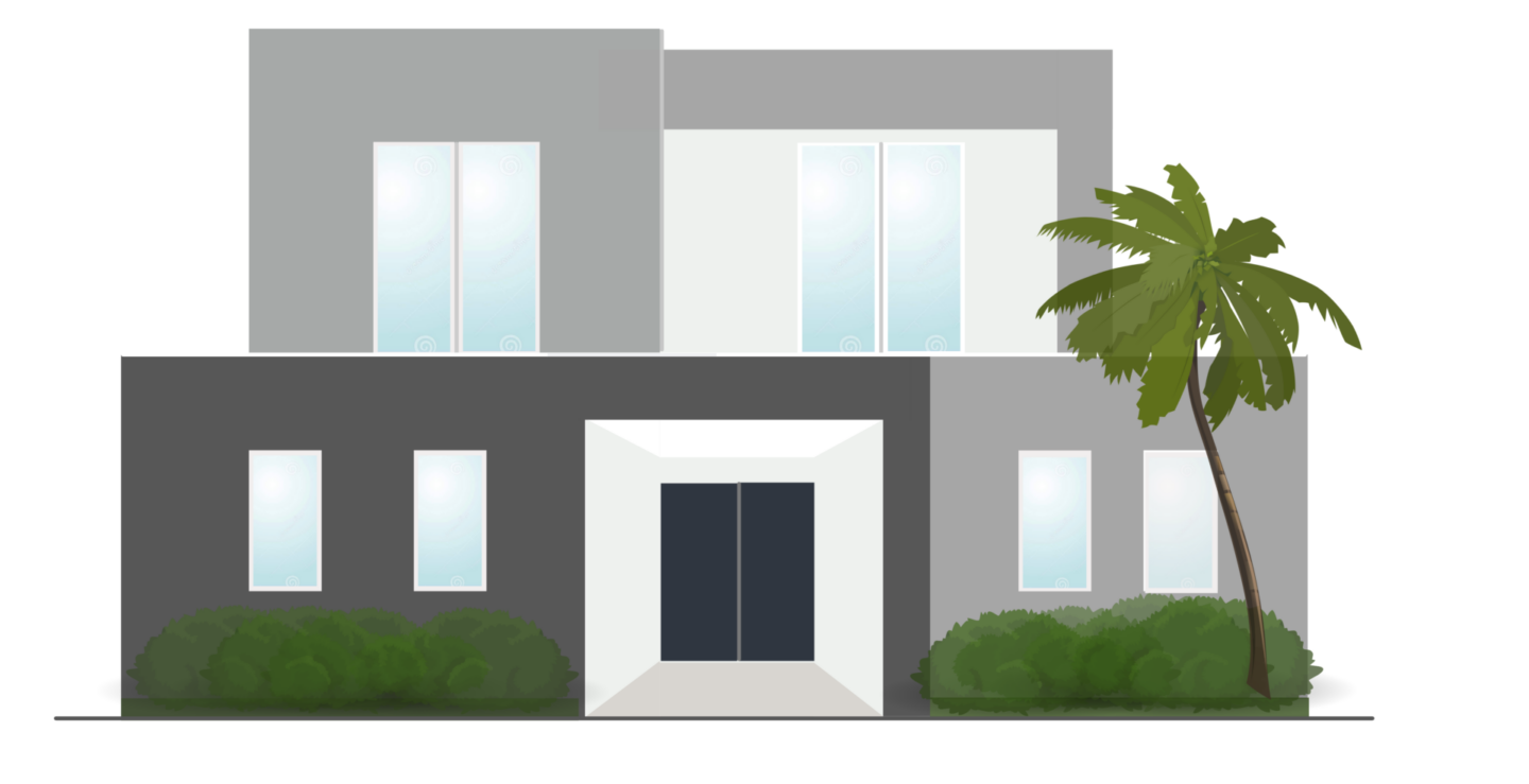
The 2021 façade colour scheme used the black front doors and Colorbond Monument garage doors as a starting point and developed a scheme based on the New Neutrals colour strategy, whereby relatively strong contrast Sectional colour was applied to the front façade to enhance the building’s clean Minimalist lines. The scheme recommended replacing the short external window shades with an architectural pelmet across the first floor to provide shade. Another recommendation was to replace the black powder-coated balcony railings with glass thereby minimizing the visual intrusion of this detail.
Client feedback: We were very impressed with the presentation and feel we finally have a workable solution to our front façade. You knocked it out of the park when suggesting it’s stark lines could be presented as a raw beauty. It’s all in the eye of the holder. From ugly duckling to elegant swan – bring it on.