Evidence-based colour strategies can help achieve objectives beyond aesthetics in interior design for commercial, corporate and residential projects.
Some of the outcomes colour can help to achieve in interior design include:
- Encourage greater engagement and interaction, especially in public spaces
- Activate areas previously little-used
- Create visual cohesion among a suite of spaces using the same hue and/or tone
- Improve orientation by using colour to identify key spaces
- Improve wayfinding by using colour/contrast to create pathways and routes
- Link interior with exterior spaces by using similar hues and tonal values
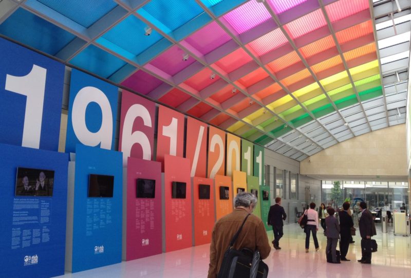
- Create a sense of vibrancy and energy using a variety of hues and tonal values
- Create a sense of drama by varying saturation and tonal value levels
- Convey corporate strategies by leveraging common colour meanings
- Reinforcing brand personality by using colour as a visual signifier
In addition, evidence-based colour strategies in the built environment can help to improve Environmental Visual Literacy in a range of contexts including aged care environments.
Environmental visual literacy is the capacity to ‘read’ visual cues embedded in the design of the built environment, and make sense of these in a meaningful way. It is an ongoing process that involves visual perception, direct and peripheral attention coupled with memory and cognitive processing.
Why is effective environmental visual literacy important? Environment-behaviour research studies indicate that a range of environmental design factors can support, hinder or obstruct the interface between the built environment and human experience. An effective interface supports positive human response, functioning and behaviour for people of all ages, cultures and physical and/or cognitive capacity. An effective interface also dovetails with Universal Design principles and guidelines for applied design and the built environment.
Colour and contrast strategies can improve environmental visual literacy in the built environment and the readability of visual cues in the built environment. Not only can colour and contrast enhance engagement and interaction, they are an effective non-verbal signalling device that can support activation strategies, improve orientation and wayfinding, plus improve the safe operation of daily activities by highlighting key design details.
