Effective Data Visualisation Colours
Creating effective data visualisation colours is more than just choosing colour by hue. To ensure that data visualisations are effective across PowerPoint and online displays, there needs to be sufficient tonal contrast and variation among the selected colours. Effective contrast ensures that there is visual differentiation between and among text, background and key elements.
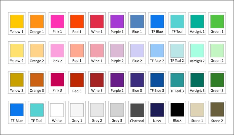
I created this colour array for Taylor Fry, a leading independent consultancy firm providing analytical and actuarial advice to government and business.
Previous data visualisation colours were not working for Taylor Fry because of a relative lack of tonal contrast among selected colours. This meant data visualisations and PowerPoint illustrations that were difficult to read and decipher.
Colour is just one of a number of design elements that contribute to good data visualisations. However, given the role that colour/contrast plays in visual perception and object identification, colour/contrast is without doubt integral in ensuring that visualisations are effective.
A starting point for many firms is to use their brand colours in data visualisations. But this is only so good as the level of colour/contrast in their brand colours and usually firms need to add a larger array of colours to avoid boring or repetitive data visualisation images.
Forbes Magazine provides some tips on Data Visualisation tools here
