Disruptive Colour is the title of an article I’m currently writing.
A key twenty-first century colour strategy, Disruptive Colour is now evident across many areas of applied design and architecture. Disruptive Colour involves combining unusual, atypical colour combinations; using colour in a wholly unexpected and incongruous way; or, using immersive colour on a large, unexpected scale.
There are two main reasons that Disruptive Colour is effective. Firstly, Disruptive Colour relies on incongruity and as a result, it catches and holds our attention. We are intrugued and are prompted to find out more and delve deeper. In this way, Disruptive Colour echoes Neville Brody’s 1980’s approach to graphic design who’s visually ambiguous work often required time to decipher: “I see my role partly as a catalyst for thought and for questioning.”
Secondly, colour can act like an antidote in dark times. This is particularly true now when political events prompt widespread social despair, anger, and upheaval. We are all affected by the refugee crisis in the Middle East and Europe, and the flow-on effects including actions like Donald Trump’s ban on Muslims from seven predominantly Muslim countries. When we need a break from protesting and helping to make the world a better place, we want to find sanctuary in places and among people that share our values.
In architecture and interior design, Disruptive Colour has the capacity to compleetely transform public and private spaces, and convey meaning and a sense of escape. This is the logic behind Pantone’s 2017 Colour of the Year ‘Greenery’, which symbolizes hopefulness, new growth and renewal. In addition, Disruptive Colour shares some similarity with Faith Popcorn’s 1981 notion of ‘Cocooning’, which recognized our need to stay at home and turn our homes into safe havens from perceived danger. Now when we venture out, we’re often keen to find public places that make us forget our woes and despair of current events. The places that do this best are those that are designed to provide some magic, a link to familiar, favorite pastimes plus a visual holiday from the day-to-day.
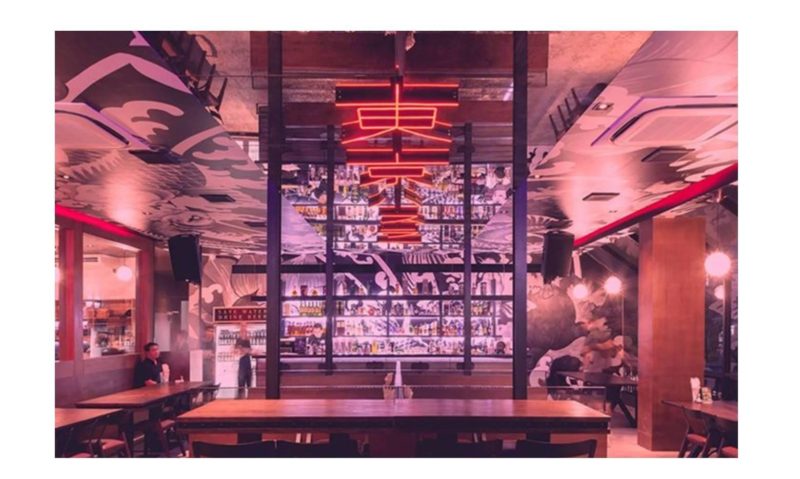
Design studio PHTAA used Disruptive Colour in Tokyo Hustler, a unique restaurant/bar in Bangkok that brings to life the design aesthetic of Neo-Tokyo. The design evokes traditional Japanese culture blended with the glowing, vibrant colours and design elements of Japanese anime, and in particular the future world depicted in the 1988 anime classic by Katsuhiro Otomo, Akira.
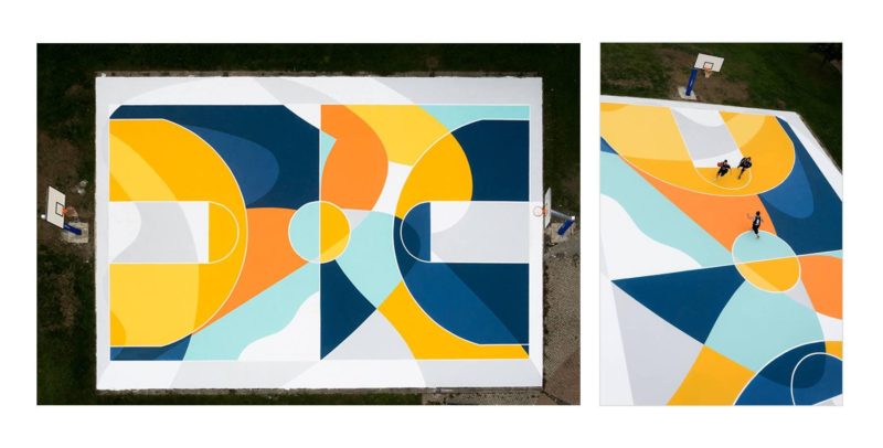
Similarly, Sicilian street artist Gue has reimagined a humble playground in the Italian city of Alessanria. The basketball court in Carlo Carrà Park is completely transformed with saturated colour. The project illustrates how Disruptive Colour can contribute to urban regeneration and redevelopment.
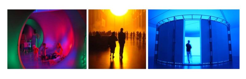
Disruptive Colour in interior design owes much to the immersive colour installations by artists such as Olafur Eliasson and larger scale installations such as Mirazozo, Sydney.
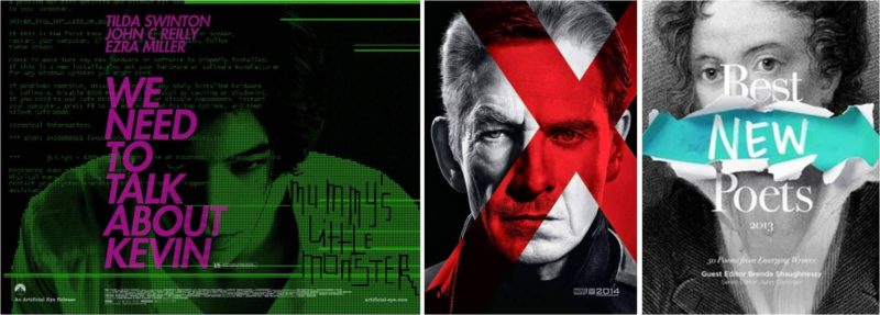
The impact and effectiveness of Disruptive Colour is evident in the poster for We Need to Talk About Kevin (2011) which features the unusual combination of purple and green. This colour combination serves to highlight the odd character of the main character Kevin. Similarly, Disruptive Colour highlights key themes in the film poster for X-Men: Days of Future Past (2014) and the book cover design of Best New Poets (2013).
In marketing and advertising, Disruptive Colour is often used to reinforce or support communication objectives. These objectives may have to do with re-branding an existing product, presenting a unique new product line or presenting the product in such a way that it appeals to a new audience or target market.
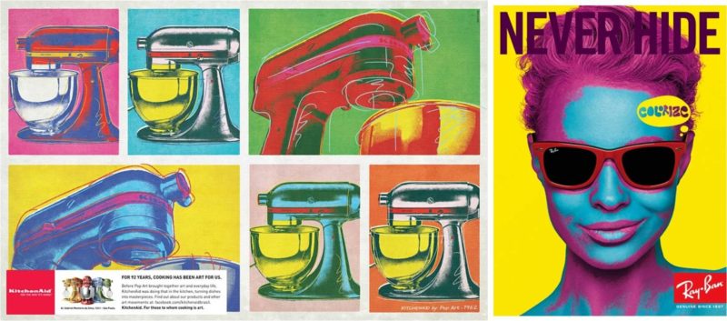
For example, the 2011 advertising campaign by DDB Sao Paulo for Whirlpool KitchenAid was part of a series that featured the tag line: ‘For 92 years, cooking has been art for us.’ The ads feature KitchenAid products depicted in different artists’ styles including that of Andy Warhol using Disruptive Colour. In doing so, the campaign presented the product in a new light and was able to target different, possibly previously unreachable markets. Similarly, Ray Ban’s ‘Never Hide’ 2007 campaign, developed by TBWA/CHIAT San Francisco with Carat International, features Disruptive Colour. The use of colour reflects the campaign aims which focussed on encouraging Ray Ban wearers to be brave, authentic and unique. Stefan Sagmeister’s cover for TL Mag (2015) features Disruptive Colour.
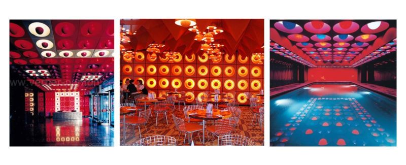
One of the first designers to use Disruptive Colour in interior design was Danish designer and architect Verner Panton (1926-1988). Panton believed that “colour is more important than form.” His key aim was to use colour to transport people into unfamiliar surroundings and trigger the imagination because “Most people spend their lives living in dreary, beige conformity, mortally afraid of using colours.” Panton used Disruptive Colour as a key strategy when he designed the interiors of the Spiegel Publishing house building in Hamburg (1969). Given that the primary focus of Spiegel employees was black and white text-based work, Panton used colour as a disruptive device that would serve as a visual holiday or mini ‘escape’ for employees.
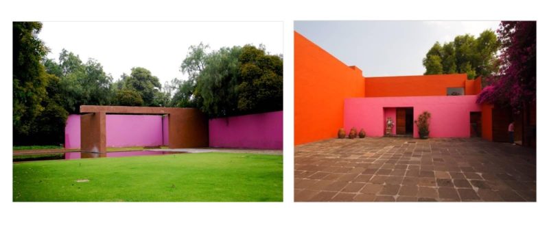
Similarly, Prize-winning Mexican architect Luis Barrágan (1902-1988) is renowned for using vivid Disruptive Colour in his buildings including Fuentes de los Amantes horse ranch (1966), Towers of the Ciudad Satellite city (1966-68) and Casa Gilardi (1976). Barrágan uses colour to evoke the “humble majesty” of colourful Mexican streets and create a sense of the extraordinary, and his use of colour often appears even more disruptive due to the juxtaposition with contextual colour.
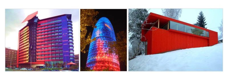
French architect Jean Nouvel (b1945) also incorporates Disruptive Colour on a grand, extraordinary scale. His approach is evident in the façades of the Hotel Puerta America, Spain (2003) and the Torre Agbar tower, Barcelona (2005). Luminous LED windowpane devices are built into the façade of the Torre Agbar, generating a vivid array of colours during the day and night. Disruptive Colour features in the vivid façade of the Red House by Jarmund Vigsnaes Architects (2002). This strident façade colour contrasts with its natural, green surroundings and, while the colour was used by the architects to reflect the dynamism of the project and the personality of the owner, it inevitably serves as a disruptive visual element in any season.
For more detailed information about Disruptive Colour refer to ‘Effective Colour Strategies’ by Zena O’Connor available on Amazon.com
Image of Tokyo Hustler (2016) restaurant/bar in Bangkok from PHTAA design studio.
To find out more about the reimagined basketball court and Sicilian street artist Gue go to Designboom.
