AIC2020, the annual conference of the International Colour Association, was due to be held in Avignon, France, but due to Covid-19, it was entirely online.
Over 90 papers were presented and 25 countries participated. I originally submitted four abstracts in the first call for papers – hoping to get to Avignon – and was honoured to have all four abstracts accepted for presentation.
Of my four presentations, ‘Tactical Urbanism: Colour interventions with purpose’ was mentioned in the concluding remarks by Emeritus Professor Françoise Viénot and it was published in the leading peer-reviewed journal: Color Research and Application, You can access the published paper via this link. The AIC2020 Proceedings can be accessed via this link.
Tactical Urbanism: Colour interventions with purpose
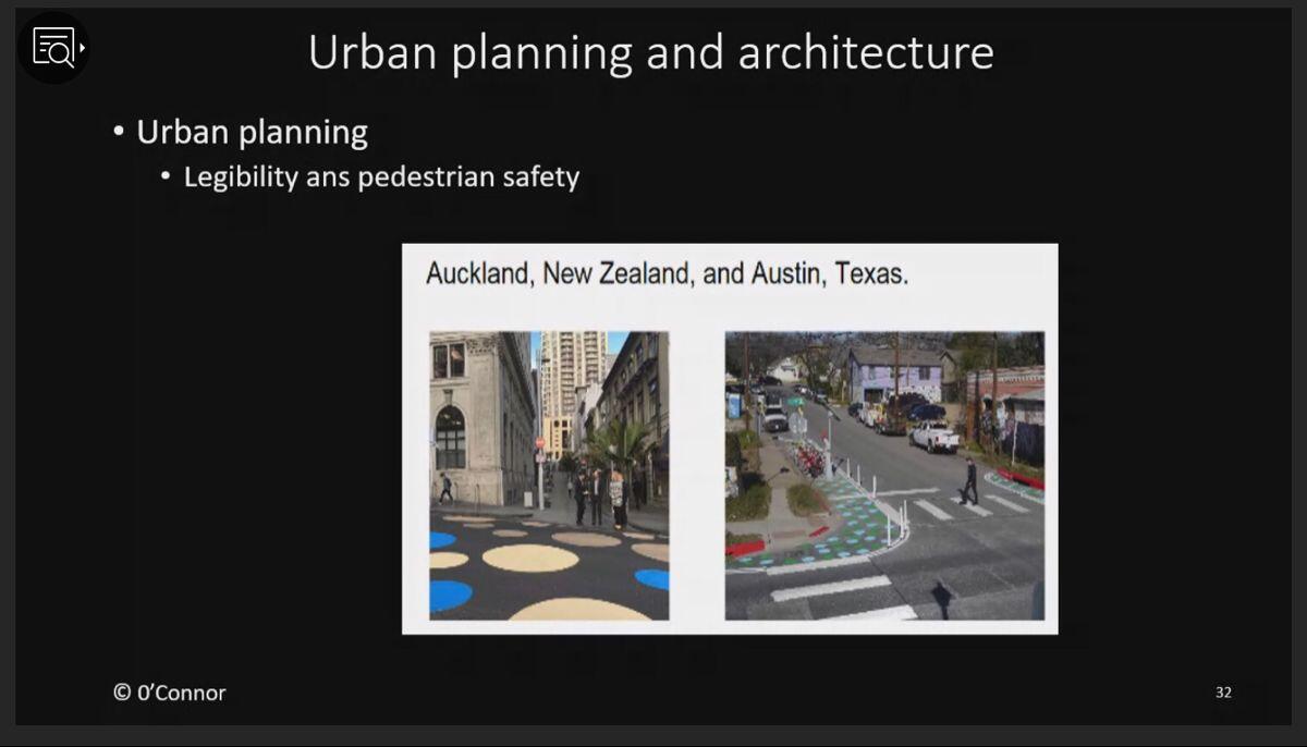
Evidence-based colour interventions in the urban landscape are becoming more common in many countries and some have garnered the term ‘tactical urbanism’, defined as relatively low-cost changes to the built environment intended to provide a quick solution to an urban environment challenge. This paper reported on colour interventions that aim to calm traffic, prioritize pedestrian traffic, support safety initiatives, and enhance the urban environment. Inspired by both large and small interventions around the world, the rationale for two proposed colour interventions in Sydney is described along with the findings of a two-stage survey that was conducted to evaluate the effectiveness of the proposed colour intervention designs.
Colour design and dementia: Evidence-based strategies to enhance environmental visual literacy
This paper brings together two strands of my previous research: visual literacy and post-occupancy evaluation in aged care environments. In this context, an ineffective interface between the built environment and older people as well as people living with dementia can be highly problematic. Recently, inappropriate environmental design was identified as one of the two most common triggers for severe, aggressive behaviours in people living with dementia, the other being unidentified pain issues (Judd, 2016). In light of this, effective interior design is an imperative for people living with dementia and evidence-based colour design strategies can support a number of key design aims relevant to this cohort: a) improve environmental visual literacy by maximising opportunities to ‘read’ and understand the built environment in a meaningful way; b) address the changes in visual perception often experienced by people living with dementia; c) encourage and improve engagement, and contribute to a sense of wellbeing among people living with dementia; and d) support strategies that address inclusivity and a user-centred approach to environmental design. This discussion focuses on evidence-based colour strategies that support environmental visual literacy and address changes in visual perception experienced by people living with dementia. These evidence-based colour strategies can elevate interior colour design beyond aesthetics to a meaningful and effective means of improving the experience, dignity, and quality of life for people living with dementia. Future in-situ research will explore the extent to which these aims are achieved for people living with dementia.
Legendary pigments: Bridging the gap between the natural world and the digital world
This paper explored a cluster pigments and dyes that have become pre-eminent over time, and aimed to bridge the gap between the natural world and the digital world by identifying this cluster and documenting their colour characteristics using digital technology. The cluster was deemed to have achieved ‘legendary’ status due to their cost and perceived value; and ubiquity across art, architecture, and applied design. This cluster was explored with reference to prominent artworks that feature these well-known pigments and dyes. Digital colour mapping was used to document this cluster of pigments and dyes, notating their colour characteristics using a relatively high level of specificity. An artefact of this study was the observation of strong patterns of similarity between specific pigment and dye colours, and their continued use in logo design and branding including vermilon, carmine, ultramarine blue and Prussian blue.
Reframing colour within the context of design education: Applying Q-methodology to enhance insight and learning
This paper described a simple, new approach to exploring colour within the context of design education. It is an approach that is suitable for undergraduate and post-graduate study as well as continuing professional education for those working in applied design and design of the built environment. Under this approach, students use visual stimuli in conjunction with Q-methodology to explore, compare, and discuss colour nuances, thereby enhancing their insight about colour. Q-methodology (including Q-sort and F-sort techniques) is frequently used in social and educational research, and in this instance the methodology is used to explore colour by sorting visual stimuli according to a set of self-generated (F-sort) colour clusters and classifications as well as pre-determined (Q-sort) colour constructs. The visual stimuli specified for this approach is a set of colour cards which includes a range of colour nuances linked to common colour notation systems frequently used in applied design and the built environment. The colour card set features hues in a wide range of tonal values and saturation levels, as well as achromatic colours including white, black and a range of greys.
Here’s a link to the book of abstracts and the conference proceedings will be published by the AIC in due course.
Keywords: Tactical urbanism, colour intervention, evidence-based colour, urban design, urban colour, colour theory, colour education, colour constructs, conceptual colour models, colour application, Legendary pigments, pigments and dyes, natural colours, digital colours, colour application, colour design, dementia design, environmental visual literacy, interior design
