In this post, I discuss the projects where I’ve used colour strategies to improve engagement, customer/client traffic, orientation and wayfinding in commercial interiors.
‘Meditrainean’ Restaurant – June 2016
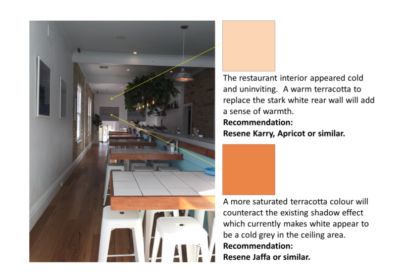
This restaurant, which features a train of small dishes, had a make-over recently. It’s predominantly white and blue colour scheme reflected the Mediterranean aesthetic. Unfortunately, a downside of the colour scheme was that it made the restaurant look cold and uninviting. In addition, shadowing at the rear of the restaurant made a white ceiling appear dull grey.
The proposed solution was a modified colour scheme that introduced a warm terracotta to the existing white and blue interior. Two hues were included: a terracotta tint for the rear wall and a more saturtaed terracotta colour for the rear ceiling. These colours offset the cool, uninviting ambience and addressed the grey ceiling. As at July 2016, the wall colour was changed and the ceiling is yet to be painted.
You can check out their menu here.

East Hotel, Canberra – September 2015
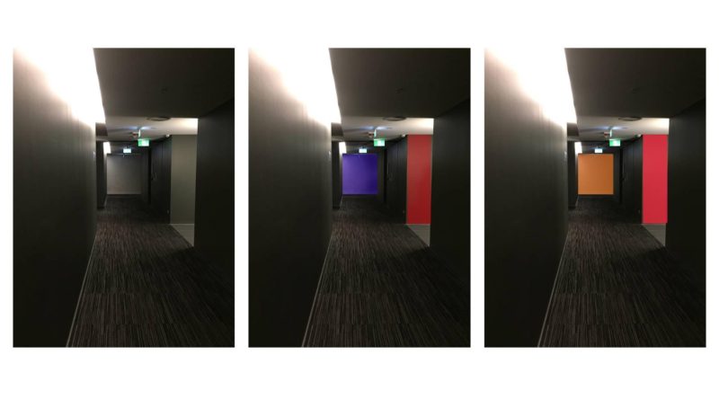
After staying at the fabulous East Hotel in Kingston, I provided a colour solution aimed at improving orientation, ambience and wayfinding in the lift lobbies and corridors.
The public rooms of the East Hotel are welcoming, interesting and engaging. However, the lift lobbies and corridors on the accommodation levels do not match the richness of design evident in the public areas. Specifically, the lift lobbies and corridors are a uniform grey and lack colour, artwork and visual variety. In fact, wayfinding for guests is hampered by the lack of visual ‘landmarks’ and the underwhelmingly grey interior colour scheme.
This evidence-based colour solution was provided to Dan Bisa of Bisa Property, developers of the hotel. This colour solution incorporated findings from recent research studies on colour in the built environment.
I can recommend East Hotel, which is centrally located on Canberra Avenue, Kingston. Check out amenities and rates on their website.