
Launched in March 2017, @colour.design.palettes on Instagram explores the ways in which colour strategies are applied in design and the colour palettes of prominent design styles and designers. Check out @colour.design.palettes on Instagram.
Colour, tonal value and saturation are dimensions of colour that can be used to create impact and identity, encourage engagement, and contribute to mood and ambience in applied design and architecture. Colour schemes usually have an underlying colour palette or dominant colour theme over which the designer adds secondary colours and accent colours.
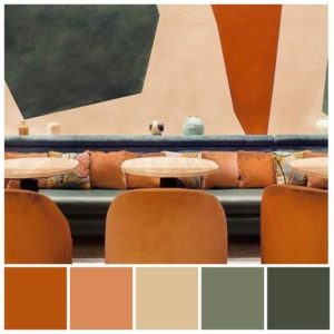
Tertiary Colour Schemes feature colour variations between secondary colours: orange, green and purple. Tertiary colour variations between orange and green is often referred to as the ‘Forest’ palette because of hue similarity with the colours of nature and forest landscapes. This image features Pierre Herme and L’Occitane’s sensory experiment in Paris. The interior design by Laura Gonzalez utilised a muted colour ‘Forest’ palette inspired by Cezanne paintings.
Daniel Romualdez. Philippine-born American architect Romualdez was listed as listed as one of 100 best designers by Architectural Digest magazine 2017.

Sue Timney (b1950). This British designer became obsessed with black at art school and thereafter black paired with white became a signature feature of her interior design and her product designs for Timney Fowler: wallpapers, textiles and ceramics. This image features Timney’s home and a converted water tower residence, London.

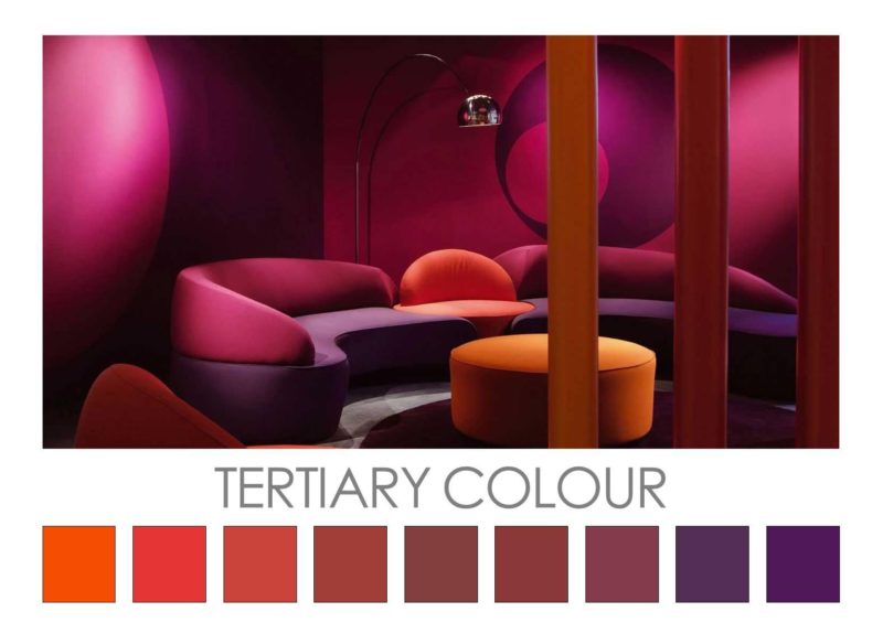
Tertiary Colours: Orange-Purple. The northern foyer of the Sydney Opera House (1973) features purple carpet set within a timber and concrete interior. The resulting tertiary colour scheme of predominantly orange-purple imbues the foyer with a unique, dramatic identity and ambience. The design of the interiors was completed by architects Todd, Hall and Littlemore after the departure of Jørn Utzon in 1966. Utzon’s intention was to use rich colours for the interiors in order to create a festive mood and convey a sense of the extraordinary.
German-born, American designer Vladimir Kagan (1927-2016) designed the ‘Comete’ sectional sofa suite for Roche Bobois in 2003. When Kagan died in 2016, Roche Bobois released a tribute to Kagan and this image features Kagan’s ‘Comete’ sofa suite in a rich colour palette of oranges, pink-purple and purple.
Stephen Shadley’s interior design for Jennifer Aniston’s Beverly Hills home featured in Architectural Digest in October 2013. The tertiary colour scheme of orange-purple is set within a residence that features timber and stone details. This tertiary colour scheme suits the architectural setting, conveys a unique mood and ambience, and gives the setting a strong identity that suits its celebrity owner.
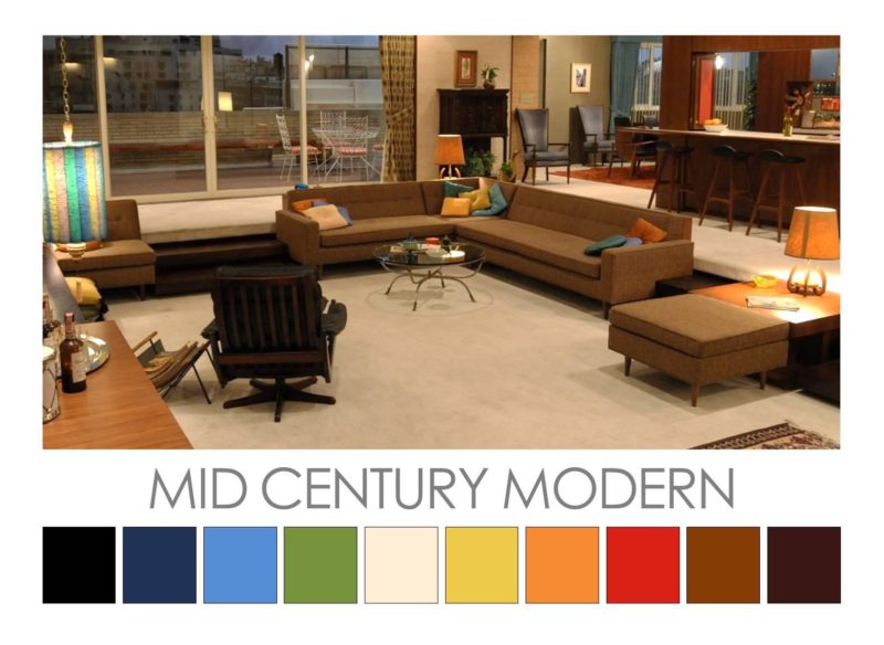
Mid Century Modern (20th century). Now recognized as a unique design aesthetic, Mid Century Modern represents a cluster of architecture, graphic design, product and interior design from c1935 to 1965. The colour palette of Mid Century Modern features black, browns and tans, and off-white coupled with saturated colours: dark and mid orange, dark and mid blue, green, red and yellow. The image featured here is from the TV series ‘Mad Men’, created by Matthew Weiner. Dan Bishop (Production Designer) and Amy Wells (Set Decorator) recreated a Mid Century Modern aesthetic using classic period furniture and a colour palette drawn from the era.
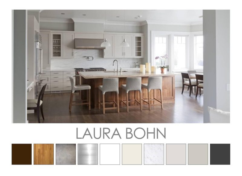
Laura Bohn (New York). Known as the ‘Queen of Soft Modern’, Bohn’s colour palettes feature hues drawn from the same hue/tonal value family enhanced with accents of unexpected hues, pops of stronger colour saturation as well as texture to add visual interest. With a preference for monochromatic colour palettes, Bohn uses neutrals but avoids beige as it can “easily turn muddy and anonymous”. She avoids too little colour/contrast and aims for subtle contrasts. Bohn uses variations in finish (matt, satin, gloss) and texture (timber, marble, metallics), adds light/white ceilings and marginally darker accents for visual contrast. Bohn avoids hues that may be incongruous, shocking or obtrusive. A clever trick that Bohn applies is to paint a hallway grey (such as Sherwin Williams Dovetail) and paint the adjoining rooms marginally lighter (Sherwin Williams Repose Gray) as these rooms then seem lighter and more spacious in comparison.
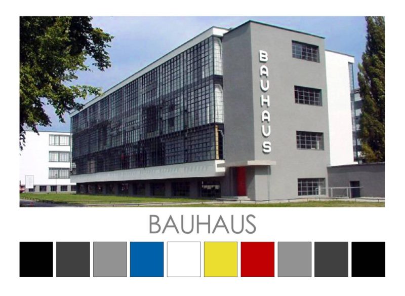
Bauhaus (1919-1933). The Bauhaus colour palette is achromatic with a minimal use of colour, predominantly the primary colours of red, yellow and blue. The Bauhaus design aesthetic eschewed embellishment and revolved around functionalism and modernist principles and elements of design. Light-dark contrast was considered a key element in Bauhaus design and this is due to Itten’s belief that colour contrast and especially light-dark contrast could be highly expressive and can help to create focus as well as convey mood, ambience and atmosphere in applied design. The Bauhaus building at Dessau was designed by Walter Gropius and features an achromatic exterior and interior interspersed with pops of primary colour: red, yellow and blue.
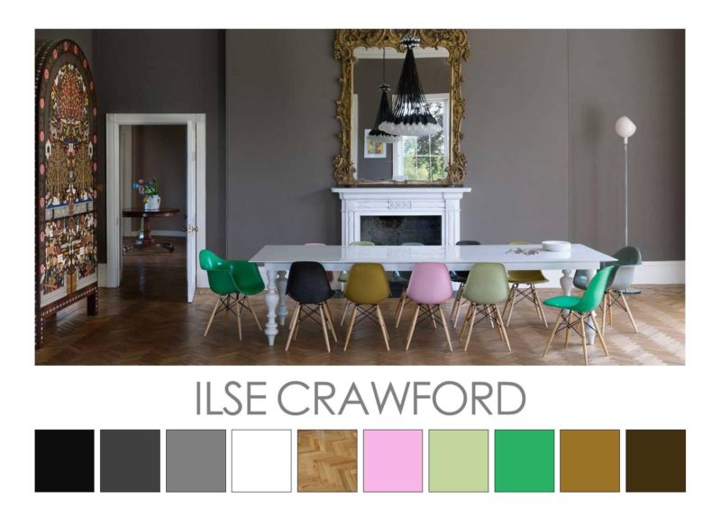
Ilse Crawford (British, b1962). Crawford’s colour palettes are underpinned by a minor tonal chord in neutrals (revolving around white or grey or warm beige). This underlying colour palette is enlivened with muted colour at the same tonal level plus accent details in stronger saturated colour, metallics and dark brown or black. The underlying palette creates a cohesive visual ambience that is often calming and cocoon-like, providing a restful canvas for human activity. Ilse Crawford studied history, worked with an architecture firm, was launch editor of Elle Decoration and worked with Donna Karan before moving into interior design. Crawford is a designer and academic who aims to put human needs at the centre of her work. As founder of Studioilse, together with her multi-disciplinary, London-based team, Crawford creates environments where humans feel comfortable and public spaces that make people feel at home. Furniture and products are designed that support and enhance human behaviour and actions in everyday life. As founder of the department of Man and Wellbeing at the Design Academy Eindhoven, Crawford’s mission extends to encouraging students to ensure their creative output improves the reality of life.
For more information go to Studio Ilse website.
Images feature Duddell’s Arts Club, Hong Kong (2013); Ett Hem Hotel, Stockholm (2012) and Dinder House, Somerset (2009).
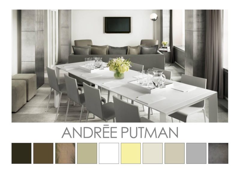
Andrée Putman (French, 1925-2013). After an initial career in music, Putman worked for Elle and L’Oeil magazines where she mixed with artists and designers. It is likely that she developed a relatively austere design aesthetic as a reaction to her wealthy heritage. At age 53, Putman established Ecart Paris, a firm dedicated to showcasing the work of classic furniture designs. In addtion, Putman designed residential, retail and hotel interiors and products for brands like Baccarat and Christofle. Putman designed residential and retail (including Yves Saint Laurent stores), and she helped to define the concept of boutique hotel (Morgans Hotel, 2008 & 1984).
Putman’s design aesthetic revolves around a rejection of embellishment and a focus on tonal values. Her early colour schemes were dominated by white, grey and black with occasional colours in muted tones. Her later colour palettes were based around a neutral colour palette (white and/or grey) with accents in muted hues in light or dark tones plus timber, metallics, and the occasional shot of saturated colour.
For more information about Studio Putman go to their website.
Images in order: Morgans Hotel, London (1984) for Steve Rubell and Ian Schrager owners of Studio 54; San Sebastian residence (2005); Morgans Hotel, London (2008) refurbishment
© Design Colour Palettes created by Zena O’Connor.