Radio interview ABC Radio – Dr Zena O’Connor, 1 December 2022
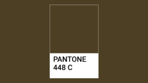
Over the last decades, many articles have focussed on the idea of using colour as a visual deterrent for cigarette smoking. Aside from printing slogans such as ‘Smoking Kills’ on the barrel of cigarettes and the use of plain packaging, some have suggested using specific colours such as Pantone 448C on packaging as a visual deterrent.
Pantone 448C, which resembles dark khaki brown, has been referred to as the “World’s Ugliest Colour” (Foster, 2106). It emerged as the key contender for ugliest colour after a series of research studies in 2012 conducted by GfK, a market research company, for the Australian government involving 1,000 participants.
In an on-air discussion Jonathon Kendall (ABC Radio, 1 December 2022), Dr Zena O’Connor focused on several ways in which colour could be used as a visual deterrent for smokers. One option is the use of a colour such as Pantone 448C on packaging. However, smokers have become relatively immune to the use of graphic imagery linked to health issues placed prominently on cigarette packaging and similarly, smokers may become visually immune to the use of a singular colour no matter how ugly it may be perceived. In addition, colour trends are fickle and dark brown and khaki colours have been known to be both in and out of fashion from time to time. Therefore, if a dark khaki brown like Pantone 448C is in fashion, this may diminish its effectiveness as a visual deterrent for smokers.
An alternative option is to use a variety of garish, highly saturated, contrasting colours that visually clash in combination and which are the opposite of any of the more familiar versions of ‘harmonious’ colour combinations. This option would involve the use of atypical colour combinations or colours that are used was warning signs common in the animal and insect kingdom or from warning or danger signage frequently used in everyday situations.

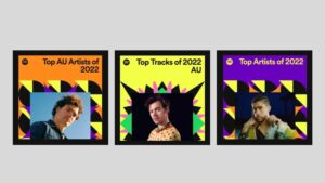
A drawback of this approach is that even saturated, contrasting colour combinations are also found in more benign situations and settings. A recent example is the visual imagery used by Spotify for its end-of-year music wrap 2022. The imagery for this campaign features saturated, contrasting colour combinations, and many of the colours are visually similar to those used in danger and warning signage.
However, the Spotify campaign doesn’t feature red which is a key colour in respect to attracting attention, encouraging engagement, and often used in danger and warning signage due to its connotations with injury, death, and warning especially when coupled with black.
While colour has the capacity to influence behavioural response, the interface between colour and human response is complex and always open to the influence of a range of factors including context and preference as well as colour trends. The issue of identifying colours or colour combinations that may act as a visual deterrent is an important issue that warrants further in-depth research of a comprehensive nature, and which acknowledges and accounts for the various factors that may influence colour and human response. In this context, the process of identifying colours or colour combinations for use as a visual deterrent would benefit from research studies that involves a large sample group (especially in terms of cultural background and age) and which investigates colour/s across a range of varying contexts.
References
Chrysanthos, N. (2022). Individual cigarettes could carry ‘smoking kills’ warnings: Health minister. The Sydney Morning Herald, November 30, 2022. Accessed on 30 November 2022 from https://www.smh.com.au/politics/federal/individual-cigarettes-could-carry-smoking-kills-warnings-health-minister-20221130-p5c2gs.html
Elliott, A., Fairchild, M.D. & Franklin, A. (2018) Handbook of Color Psychology. Cambridge: Cambridge University Press.
Ferrier, M. (2016). Stylewatch: Is Pantone 448C really the ugliest colour in the world? The Guardian, Thursday 9 June 2016. Accessed on 18 November 2017 from https://www.theguardian.com/fashion/2016/jun/08/stylewatch-pantone-448c-ugliest-colour-world-opaque-couche-australian-smokers-fashion
Foster, K. (2016). ‘World’s ugliest colour’ used on cigarette packets to put smokers off. The Independent, Saturday 11 June 2016. Accessed on 18 November 2017 from https://www.independent.co.uk/news/world/australasia/world-s-ugliest-colour-revealed-pantone-448c-a7076446.html
Livingstone, M. (2002). Vision and art: The biology of seeing. New York: Abrams.
McNeil, D.G. (2016). How to get smokers to quit? Enlist the world’s ugliest color. New York Times, June 20, 2016. Accessed on 18 November 2017 from https://www.nytimes.com/2016/06/21/health/cigarette-packaging-ugliest-color.html
O’Connor, Z. (2015). Colour, contrast and Gestalt theories of perception: The impact in contemporary visual communications design. Color Research and Application, 40 (1), 85-92.
O’Connor, Z. (2011). Colour psychology and colour therapy: Caveat emptor. Color Research and Application, 36 (3), 229-234.
O’Regan JK. Solving the ‘real’ mysteries of visual perception: The world as an outside memory. Canadian Journal of Psychology 1992;46(3):461-488.