A faculty member at Pratt Institute, Maitland Graves published two books during his tenure, The Art of Color and Design (1941) and Color Fundamentals (1952). Graves is also known for his Design Judgement Test, which was included in The Art of Color and Design. In 1958, Graves left Pratt after 28 years at age 56. The Art of Color and Design is an interesting book due to the way Graves describes a selection of color and design constructs in a useful, visual way; however, the contents are largely drawn – almost verbatim – from other sources. Graves’ Design Judgement Test generated considerable criticism and the author and his books all but sank without trace in the decades after he retired from Pratt.
______
Maitland Erwin Graves (1902-1978) was born in New York city, the son of Maitland E. Graves and Josephine Cortes. A year after he was born, Graves’ father filed for bankruptcy due to a failed hotel development project and, after going to Europe with his family, Graves’ senior died in 1909. Graves, who may have started painting in Europe, began teaching at Pratt Institute and also taught at Hunter College (part of the City University of New York) and New York University. Secondary commentary about Graves’ teaching career mentions roles at multiple institutions in narrative form, but these are not backed by direct archival records or faculty directories accessible online. Graves’ teaching overlapped significantly with the publication and his classroom use of his own textbooks, and a strong focus on teacher education plus the institutionalization of “elements and principles of design” in U.S. curricula.
Graves was employed as a faculty member at Pratt Institute from 1930 to 1958. Despite spending 28 years at Pratt, he is mentioned sparingly in a couple of issues of Prattonia, the annual magazine of Pratt Institute, (Pratt Institute archive, 2024). In the 1954 issue of Prattonia, Graves’ name is among fifty-five faculty members in the Art School at Pratt, where he is listed as an Instructor (Life Drawing and Anatomy). In 1956, he is listed as faculty member (Illustration and Advertising Department) and the following year, he is listed as an assistant professor. When Graves left Pratt in 1958, he was included in the Art Education department but is not listed as holding any educational qualifications or role. In the last ten years of his time at Pratt, the Institute was undergoing generational and pedagogical change, as indicated in various issues of Prattonia.
Graves left Pratt after he published The Art of Color and Design (1941) which contained the early version of his Design Judgement Test. Graves’ early departure from Pratt at age 56 is not surprising for three key reasons. Firstly, his time at Pratt appears to have been wholly unremarkable. Secondly, Graves’ book was out of tune with the pedagogical approach at Pratt and many other design education institutions during the mid-century when the focus shifted from prescriptive ideas about “correct” design and aesthetics, to design exploration and experimentation and the notion of multiple design solutions. Thirdly, Graves’ Design Judgment Test was widely debunked, as discussed in greater detail below.
Graves’ ideas were out of step with the reforms in art and design education that occurred from the late nineteenth century through to the late twentieth century. These reforms advocated a move away from design replication and prescriptive ideas about art, color and design, to more generalized principles that could be applied in response to consumer demand, changes in manufacturing, the introduction of new materials, and the emergence of a focus on individual creativity (de Noblet, 1993; Hauffe, 1998; Raizman, 2003). The pedagogical imperative at the time in America was concerned with the creative growth of the individual artist and designer. Various elements and principles of design that had been devised by design theorists such as Denman Ross (1907) and promulgated by subsequent authors like William Garrison Whitford (1929, 1937) served as a means of enabling students to explore and develop their creativity and subjective responses when developing solutions to art, color and design problems. Graves ignored this aspect of pedagogy, and this is detailed in a harsh review of The Art of Color and Design in the Journal of Aesthetics and Art Criticism (1942). This review highlights Graves’ focus on surface attributes (elements and principles of design) at the expense of a “complete denial of meaning” because the role of individual creativity, human interests and values are ignored.
In respect to his pedagogical approach, Graves came to be at odds with art and design education during the mid twentieth century. His prescriptive approach within the context of “correct design” implied that this notion ignored individual creativity. Graves was firm in his conviction that “many artists adopt a subjective approach and perhaps…might attain greater success if they had a conscious perception of aesthetic order” (Graves, 1951, pvii). However, other more prominent art and design educators such as Denman Ross (Professor of art and design, Harvard), Arthur Wesley Dow (Pratt Institute, Professor of art at Columbia University), and the Bauhaus had been applying a different pedagogical approach for some years before Graves’ time. While Ross promulgated elements and principles of design and theories of color in his teaching, these were the “visible manifestation of the human imagination”, he considered these to “cultivate their powers of creativity” through experimentation and exploration (Frank, 2011. P54).
The Art of Color and Design (1941)
Shortly after its publication, The Art of Color and Design received a scathing review from Dr E. N. Barnhart, and it is likely that this is the reason it did not become a widely used textbook. The compiler of the Bibliography of Aesthetic Theory, Criticism, and Psychology of Art, Barnhart focuses in on several key weaknesses of Graves’ The Art of Color and Design, the first of which is that the elements and principles of design are presented in a vacuum, removed from practical application. Graves was “entirely and intrinsically concerned with surface” and his “complete denial of meaning” negates the missing factors of human interests and values. In respect to design, color, and value, Barnhart notes that “An elaborate color scheme has been worked out so that any simpleton can secure ‘proper’ colors for his work”. However helpful such simplifications may be to the young student, and I am not too confident that they are, they are not enough by far” (Barnhart, 1942, 67-68).
It is not known whether Graves presented his ideas in a more meaningful way in the context of his teaching, but he did not become an eminent professor with a renowned body of published work. Graves’ book barely contains any original ideas, theories, methodologies or practical exercises. Several authors note that the content of The Art of Color and Design was wholly derived from other sources, including the Bauhaus syllabus (via Dr Viktor Lowenfeld of the National Art Education Association and The National Committee on Art Education; and Clyde Watson, Pratt Institute) plus the teachings and publications of Denman Ross, Arthur Wesley Dow, and Frank J. O’Reilly, as discussed below.
Smith (1996) reports that Graves was one of his teachers of design at Pratt. He notes that his classes on color and the elements and principles of design featured multiple exercises (some of which are included in The Art of Color and Design) which reflect the syllabus of the Bauhaus (1919-1933). However, in this respect, Graves is remarkably silent on the Bauhaus despite referencing Cubism (c1910s-1920s), Dadaism (c1915-1920), Surrealism (c1920s-1950s) and various “radical groups that were later purged or exiled by the Nazis” (Graves, 1951, p423). Smith also notes that “Graves work seems to me to be obviously derived from the theories of Arthur Wesley Dow, several of which are referred to in The Art of Color and Design. Dow of course began his higher education career at Pratt” (Smith, 1996, p180).
Gist (2009) notes, “Frank Reilly is not mentioned in the text but this book [The Art of Color and Design by Maitland Graves] is based on lectures Reilly gave at Pratt Institute” (Gist, 2009, p1). Inspired by Dean Cornwell, who was a friend and neighbor, Reilly took over Cornwell’s classes at the Art Students League upon Cornwall’s death. Cornwall was a highly respected and successful illustrator and mural painter, and his list of accolades is impressive (NYT, 1960). Reilly, who set up his own school of art in the early 1960s, was also a highly active and respected illustrator; however, it was his teaching that had the most long-term and lasting impact (Elwell, 2023). Elwell notes that “Reilly was particularly adept at systematizing and formularizing [color] information” (Elwell, 2023). Reilly was also influenced by Munsell, who had “turned a color identification system into a color mixing system” and he set about creating a method for correlating colors and values based on a numerical system (Elwell, 2023). Reilly’s illustrations indicate that his method featured clusters of colors and tonal values that represent chords (major and minor) and keys (high, intermediate and low), constructs that are common across painting and art theory.
Graves’ book contains numerous reproductions from the National Arts Club and the Museum of Modern Art, indicating his primary interest in art as opposed to design practice. Plus, the book also contains numerous illustrations captioned ‘Pratt student exercises’; however, Graves fails to provide more details about these ‘student exercises’ – What is the teaching context of these exercises? Are they his students or perhaps students of other educators such as Reilly or Dow?
Of the illustrations that are noteworthy, these include useful, visual representations of ‘Color Rhythm’ and ‘Color Chords’ as well as ‘Keys’ and their relationship to ‘Keynotes’. In particular, ‘Value Keys’ chart (p283), ‘Value Rhythm and Value Chord’ chart (p298), ‘Value Chord 11 W’ chart (p306), ‘D Color Chart’ (p361), and ‘W Color Chart’ (p369).
Elements and principles of design
Graves’ information about elements and principles of design were appropriated from earlier authors. Specifically, there are striking patterns of similarity between Graves’ writing and earlier texts that focus on elements and principles of design such as Owen Jones’ The Grammar of Ornament (1865) and Armstrong’s Cusack’s Freehand Ornament (1895), a widely used textbook at the London School of Art which was inspired by Professor Cusack’s texts for the City of London Day Training College (Armstrong, 1895, p11).
In addition, Graves appears to have been inspired by Whitford (1937). Chairman of the Department of Art Education and Professor of Art at the University of Chicago, Whitford identified key elements and principles of art and design, and these featured in An Introduction to Art Education (1929). At the forefront of educational reform in American art education, Whitford’s contributions in the field were considered outstanding (TSAM, 1928). He placed elements and principles firmly within the context of individual creativity, which he saw as paramount, and he made clear his aim: “illustrations, tables, graphs and condensed outlines have been included to stimulate original thinking” (Whitford, 1937, pxii).
Aside from Jones, Armstrong, and Whitford, Graves borrows heavily from Denman Ross’ Theory of Pure Design (1907) in respect to ideas and practices that focus on constructs relating to the elements and principles of design. Graves is remiss in citing some authors but not others in respect to elements and principles of design as well as color theory.
Color theories and constructs – Sourced from Bradley and Munsell and Rood
Graves sourced his ideas about color primarily from three key sources: Bradley, Munsell and Rood. We know this because Graves himself refers to these sources. However, these three authors appeared to have conducted more in-depth research than Graves and in reference to Bradley’s texts, Bradley specifically mentions his key sources of information including James Maxwell, Ogden Rood, George Field, William Von Bezold, Michel Chevreul and Owen Jones among others.
Graves suggested that in reference to color notation and applied color theory, “it was not until 1912 that Albert H. Munsell…perfected a satisfactory system of color notation and terminology” (Graves, 1951, p324). In respect to Hue, Graves replicated Munsell’s 20-hue color circle which features red, yellow, green, blue and purple as the principal hues. In reference to Value, Graves replicates Munsell’s 11-step value which starts at Black (0) through nine steps to White (10). In respect to Chroma, Graves delivers verbatim, Munsell’s various rules and regulations regarding this color attribute.
Many of Graves’ ideas relating to color clusters and color effects appear to have been drawn from Bradley, specifically constructs like Broken color, Analogous color, and so on. (Bradley, 1893; 1895; 1897). The fundamental difference between Graves’ theories and those common to traditional color theory is his definition of primary colors: “the five principal hues are red, yellow, green, blue, and purple” as opposed to red, yellow and blue. Graves’ assertion is accompanied by a hue circle diagram accompanied by the note: Courtesy of the Munsell Color Company (Graves, 1951, page 326). Graves justifies his use of the Munsell hue circle by saying, “in this country [America] the Munsell notation of color is rapidly becoming standard” and Graves frequently refers to the Munsell color system throughout his book (Graves, 1951, p180).
Value, Chords and Keys
In his texts, Graves’ is misleading when he notes, “The matter of key has been more or less vaguely recognized by artists and has been discussed in rather loose and general terms. To my knowledge no one has yet clearly named or defined these keys that are so important in art. I shall try to clarify the subject by means of the diagram (Value Keys) on page 283” (Graves, 1941, p277).
In respect to value, value scales, chords, keynotes, and keys as well as the notion of a ‘natural order of colour’, information is relatively common and several key sources feature these including Hay (1838), Field (1845), Rood (1879), Ross (1902), Denman Ross as depicted by Froehlich & Snow (1904, 1921), Munsell (1919), and Parsons (1912, 1921) (see O’Connor, 2023). Graves does not cite these authors but instead cites Sir Joshua Reynolds, James McNeill Whistler, as well as Wesley Arthur Dow. He also includes quotes from Oswald Spengler’s Decline of the West (1918, 1922) in reference to Chords and Keys, an odd source for information about color theory and application.
Graves notes that his definitions of Chords and Keys are specifically drawn from Webster’s Collegiate Dictionary, wherein references to these relate to music theory (Graves, 1941, p131). In respect to Chords and Keys, Graves suggests this is a “system or series of tones or values based on their relation to a keynote, dominant value or general tonality of the painting” with pitch relating to the high or low-key value. In reference to Major Chord, this is defined as larger or great interval. Strong contrast”; while Minor Chord is defined as “small interval, closed up, muted. Subdued or muffled contrast” (Graves, 1941, p131).
Graves fails to mention that his value chords and keys diagrams are drawn from the text-based diagrams of Denman Ross. Ross was one of a few design theorists who saw the need for the systemization of language and a shared vocabulary for color and design, and the practice of teaching and creating art and design. While Owen Jones’ Grammar of Ornament (1856) was among the first to do this in England, Ross and Dow championed the cause in America. Ross’ approach acknowledged the needs of industry and manufacturing, and he underpinned his theories with a rejection of imitation and mindless replication, and an unwavering belief in the capacity of individual creativity. Ross also rejected the French Academy approach as it “undermined the artist’s ability to think and solve problems for himself” (Rutherford, 2014, p32; Frank, 2011).
It should be noted that Ross’ Theory of Tone Relations (1902) was protected by copyright, and this may account for the differences in terminology and format despite Grave’s illustrations depicting the same content. The following illustrations features one of many of Ross’ illustrations that link to his ‘Theory of Tone Relations’ (1902) alongside Graves ‘Value Keys’ (1941). Graves has simply amalgamated Ross’ text-based ideas and illustrations into a different visual format, perhaps to avoid copyright infringement.
To summarize, The Art of Color and Design represents as an amalgam of information that appears to be primarily appropriated from earlier sources including Ross, Dow, Reilly and Munsell, some of which is used to justify Graves’ Design Judgement Test (Chapter Six). In addition, Graves’ briefly mentions Joseph Schillinger, author of The Mathematical Basis of the Arts and it is clear that Graves was influenced by Schillinger and the idea of applying mathematical proportions to value chords and keys in much the same way that Munsell did in respect to color years earlier in Atlas of the Munsell Color System (1915) and The Munsell Book of Color (1921).
Color Fundamentals (1952) by Maitland Graves was published a year after the second edition of The Art of Color and Design (1951). Oddly, Color Fundamentals regurgitates color theory sourced directly – almost verbatim – from Munsell and, while the book mentions the important role of value in color scheme development, no mention is made at all of value chords and keys. This book also received a bad review when it was published and, in his review, Sidney Newhall of the Color Technology Division, Eastman Kodak Company, highlighted several omissions and inaccuracies, and pointed out that the book heavily featured the Munsell color system (Newhall, 1953).
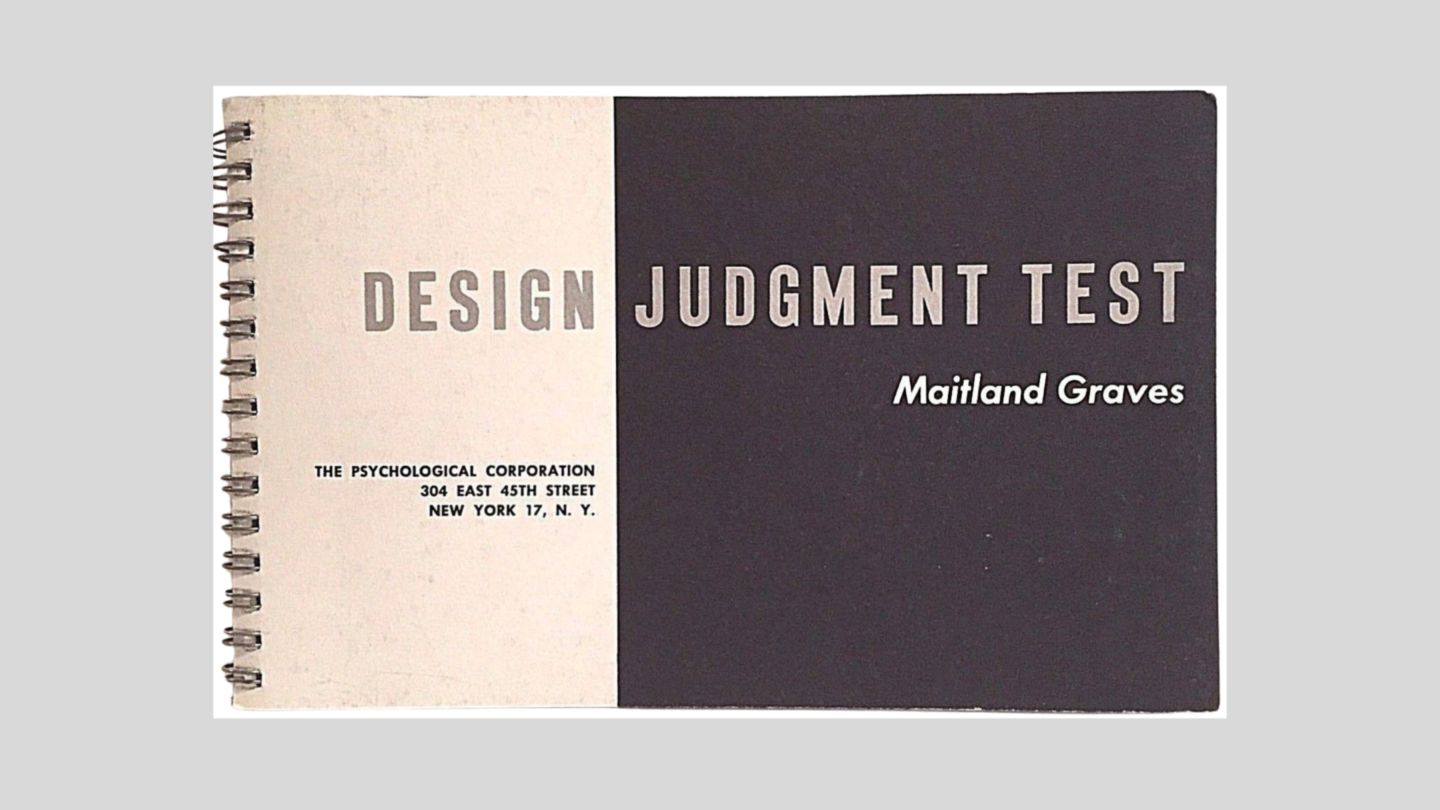
Graves’ Design Judgement Test (1948)
The first edition of The Art of Color and Design, published in January 1941, includes a forerunner to the Design Judgement Test, which Graves referred to as the Visual Design Test. In this test and subsequent variations of the test, Graves refers to “better designs” and “correct designs”, and he also includes a “Better Design” chart (Graves, 1941, pp39-48).
Graves notes that he devised the Design Judgement Test to “measure the components of aptitude for the appreciation or production of art structure” (Graves, 1951, p67). Underpinned by Graves’ hypothesis that strong patterns of similarity occur in human response to principles of aesthetic order. The Design Judgement Test was published in 1948 and included as a chapter in subsequent issues of The Art of Color and Design.
Graves’ intention in publishing the Design Judgement Test was to support his prescriptive and deterministic ideas about design wherein generalized conclusions about responses to aesthetic order could be readily applied to the population as a whole (Graves, 1951; Martin, 1972). The test involved evaluation of 32 numbered charts which displayed similar pairs of 2D and 3D mostly abstract, graphic designs. Participants chose one of a pair of graphics design and results involved tallying up the number of “right” answers.
The test included instructions and a list of which designs Graves deemed to represent “Better Design”. Graves’ judgements in this respect were underpinned by his belief that “science, philosophy, and art are expressions of man’s eternal urge to seek and to create unity in his universe” … and he believed that “man, as artist, creates aesthetic unity or man-made order by organizing time, space, mind, and matter”, and that unity stood in opposition to dominance and conflict (Graves, 1951, p80). It was a long-winded way of saying he knew better, and that he and only he recognized “better design”.
Graves’ Design Judgement Test was widely debunked. His assumption of a universal understanding of aesthetics reflects a prescriptive, one-size-fits-all approach to beauty, order, and aesthetics exists, and that this highly deterministic approach is valid. This prescriptive, deterministic approach to aesthetics was not echoed by latter twentieth century design educators (including those at the Bauhaus), design theorists, psychologists, or his colleagues at Pratt. Graves’ Design Judgment Test emerged in tandem an interminably boring debate about the notion of what is and what is not “good design”.
Multiple evaluations of Grave’s Design Judgment Test report that the Test featured poorly devised test materials and was wholly inadequate in measuring aesthetic judgment, across different generational cohorts and especially cross-cultural cohorts (Eysenck, 1967; Eysenck & Castle, 1971; Giampetro, 2015; Götz & Götz, 1974; Uduehi, 1995). After a study of 50 well-qualified students at the Royal College of Art plus professors teaching at the College who were administered the Test, Eysenck “concluded that the test does not succeed in measuring what it purports to measure” (Eysenck, 1970, p589). A Google search for the Test draws very little beyond scholarly, peer-reviewed papers debunking the Test.
Color and design education: The impact of Maitland Graves
There is scant evidence that Graves’ The Art of Color and Design had an impact on color or design theory, or color and design education and practice beyond amateur artists and designers. There is no mention of Graves in the comprehensive The Book of Colour Concepts including the sections ‘The teaching of colour’ and ‘The early 20th century’ (Loske & Lowengard, 2024). Nor is Graves mentioned in Color Ordered (Kuehni & Schwarz, 2008) or John Gage’s Colour and Culture: Practice and Meaning from Antiquity to Abstraction or Colour and Meaning: Art, Science and Symbolism (Gage, 1995; 1999).
Briggs asserts that Graves’ work was a “widely used design textbook” (Briggs, n.d.). There is no evidence to support this claim beyond Graves’ use of his own textbooks in his teaching at Pratt Institute. A Google search reveals that Graves text appears to have been cited in the past occasionally as a peripheral text but not a major text for educational purposes. Briggs also suggests that “Along with H. Barrett Carpenter’s book, [Graves’ book] had a considerable influence on colour education in Australia as a direct contributor to the curriculum of Phyllis Shillito at the National Art School (sic) and the Shillito Design School” (Briggs, n.d.). However, there are four key inaccuracies with Briggs’ suggestion, as follows. Firstly, Briggs’ suggestion is based on his paper which discusses the 1947 student workbook by Helen Jean Burgess (Briggs & Fay, 2022). Burgess was one of a group of students at East Sydney Technical College (ESTC) who were enrolled in a five-year teacher training course under the Commonwealth Rehabilitation Training Scheme (Kent, 1995; MHNSW, 2015). The primary aim for this cohort, which included Burgess, Vivienne Chaffer, Judith Cuneo, Eve Dutton, Gwenda Dorothy Hodgson, and Dorothy Senior, was to become art or design teachers and not practicing designers. Hence, the subjects taught by Shillito were expanded beyond her usual color design syllabus to include a wider range of art, color and design topics with the intention of providing these students with a broader knowledge of such topics for teaching purposes (Kent, 1995). It is within this context that Burgess’ workbook features several color theories: Shillito (20 pages), Munsell (44 pages) and Ostwald (23 pages). In the section on Ostwald, Burgess includes eight pages that appear to replicate information and illustrations from Graves (1941?); however, she does not cite or reference Graves or H. Barrett Carpenter. Aside from the first 20 pages of the workbook, it does not in any way reflect the entire three-year syllabus of the Shillito Design School (1962-1979) nor does it reveal Shillito’s pedagogical approach (O’Connor, 2021). Furthermore, at the Shillito Design School, students were not provided with class notes. While students may have taken their own notes about color and design constructs examined in class, and they may have also found additional notes from other sources. Such notes should not be confused with Shillito’s syllabus. For Briggs to suggest that common constructs (such as color discord, tints and shades, broken color, color contrasts, reduced contrasts, etc.) reveal a correlation between Shillito’s syllabus and texts by H. Barrett Carpenter is nonsense given that such terms are drawn from the lexicon of traditional color theory and are highly prevalent across the literature on color.
Secondly, Phyllis Shillito taught at East Sydney Technical College (not the National Art School) from 1925 to 1960, and later established the Shillito Design School (1962-1979) (Kent, 1995; Morrow, 2005). Shillito did not teach a rigid, unchanging curriculum and syllabus. It is obvious when comparing Shillito workbooks from different periods (ESTC and the Shillito Design School), that her curriculum and syllabus evolved in response to changes in color design trends plus changes in industry and manufacturing, as is common in design education. For clarity, Shillito eschewed rote learning and the mindless replication of color theory illustrations without the specific aim of exploration and discovery about the nuances of color and design, and their relevance to applied design projects (O’Connor, 2019, 2013).
Thirdly, when Shillito opened her eponymous school, she explicitly said that she “borrowed ideas from Ulm, Munich, Stockholm and Paris” for her design school (SMH, 1962). Shillito’s biographer notes the extensive correlation between Shillito’s pedagogy and color design syllabus and that of the Bauhaus (1919-1933), which passed its baton to the Ulm School of Design (1953-1968) after its closure by the Nazis (Kent, 1995; HfG Archiv Ulm; 2024). There is no mention of Maitland Graves or H. Barrett Carpenter in Kent’s biography of Shillito and her school curriculum and syllabus, as per a recent survey of Shillito Design School students.
Finally, Briggs and Fay contend that “the portfolio [Burgess’ workbook] is important as an early record of the colour curriculum of Phyllis Sykes Shillito” (Briggs & Fay, 2022, p248). The authors rely on only two sources for this information – Helen Jean Briggs and Eva Fay – and their research stops there. Briggs and Fay do not cite Shillito’s biographer (Kent, 1995) or any other extant former Shillito students including the author of this work, who has published several peer-reviewed articles on the Shillito Design School.
To further support the claim that Graves had widespread impact, Briggs suggests “We can get a snapshot of what [color theory] sources were influential around mid-century in the USA” and cites a survey of 35 participants by Farnum (1942). However, Briggs misrepresents Farnum’s findings in respect to Graves’ influence when he suggests, “Munsell, Graves (who used the Munsell framework) and Ostwald were in the lead of a long list” as only six participants of the sample group of 35 make reference to Graves and Farnum’s survey was conducted only a year after Graves first publication (Farnum, 1942).
While there is similarity between the color design lexicon of Graves (as well as H. Barret Carpenter), this is very common across texts that focus on traditional color theory and design from the period (O’Connor, 2021). Graves’ work regurgitated – often verbatim – the theories, ideas and illustrations of earlier color design theorists such as Denman Ross, Wesley Arthur Dow, and Frank Reilly. However, Briggs does not acknowledge this, nor does he address the critical differences between Shillito and Graves in terms of pedagogical approach and definitions of color constructs such as Color Discord. Shillito’s pedagogical focus – like that of Ross, Dow, the Bauhaus and Ulm School of Design – was creative exploration, discovery and experimentation in tandem with strategies that enhanced each student’s individual creativity. Color design constructs and principles were presented with the intention of assisting – and not undermining – the artist’s ability to think and solve problems. This approach is fundamentally oppositional to Graves’ ideas about “correct” design and rigid adherence to Munsell color. As Barnhart notes, Graves was essentially out of touch with design education in the latter half of the twentieth century. Working counter to Graves’ one-size-fits-all approach to color and design, educators such as those at the Ulm School of Design and Shillito acknowledged that there were multiple solutions to a given color design problem and that correct, or “good design” was a fallacy.
______
In conclusion, Maitland Graves remains something of an enigma. His teaching at Pratt attracted minimal attention during and after his tenure, and he did not become an emeritus professor or eminent color design authority. An extensive Google search reveals that he sold several paintings and, aside from his books (The Art of Color and Design and Color Fundamentals), Maitland Graves essentially sank without trace much like his Design Judgement Test. There is no mention of Graves at Pratt Institute beyond being listed as a member of staff, and he does not warrant a Wikipedia page. Several of Graves color theory illustrations appear unique; however, they lack attribution, and it is not known whether they were created by Graves, his students, or sourced elsewhere. An obituary was not published when he died, and no scholarly works mention his books except to debunk his Design Judgement Test. While it is not known whether Graves was sued for breach of copyright by Denman Ross, it is known that Ross along with Dow and Reilly were art education icons and widely respected authorities on color and design.
Addendum
Professor Emeritus Peter Bama of the Pratt Institute emailed me in October 2025 after reading my review of Maitland Graves. Amongst other comments, Bama found my review to be “accurate and insightful! My classmate at Pratt was his (Maitland Graves) son John, and we shared many times about how Pratt transitioned into abstraction from traditional structures…Maitland Graves did contradict the cultural of abstract freedom of modernism. He was very didactic.” (O’Connor, 2025).
Professor Emeritus Bama – who himself taught colour theory at Pratt for 20 years – confirmed my understanding of Graves’ teaching as being didactic and not exploratory. The language used by Graves reveals that he applied a teacher-centered approach and students were required to reproduce his various exercises explicitly without exploring colour on a more experiential, exploratory level. Bama himself taught
As noted in my review, the teaching of colour had moved beyond this didactic approach to an inquiry-based, experiential learning approach. While students at the Bauhaus, Shillito Design School and similar colleges explored colour using simple colour exercises this was always within a context of discovery and exploration. That is, learning about colour from a hands-on, questioning approach with allowance for alternative perspectives. Briggs is incorrect in assuming that the pedagogy at learning institutions such as the Bauhaus and Shillito Design School followed a didactic approach simply because of some extant exercise books. It is folly to think these these represent the entirety of learning at such schools.
References
Armstrong, C. (1895). Cusack’s freehand ornament. A text book with chapters on elements, principles, and methods of freehand drawing, for the general use of teachers and students. London: City of London Book Depot. https://archive.org/details/cusacksfreehando00armsrich/
Barnhart, E. N. (1942). Review of The Art of Color and Design by Maitland Graves, Journal of Aesthetics and Art Criticism, 1 (5), pp66–68. https://academic.oup.com/jaac/article/1/5/66/6255359
Barnhart, E. N. (1941). Bibliography of Aesthetic Theory, Criticism, and Psychology of Art. The Journal of Aesthetics and Art Criticism, 1 (2/3), pp140-148.
Bradley, M. (1893). Color in the kindergarten. Springfield, MA: Milton Bradley Co. https://archive.org/details/colorinkindergar00brad/
Bradley, M. (1895). Elementary Color. Springfield, MA: Milton Bradley Co. https://archive.org/details/gri_c00033125012656167/ and https://www.gutenberg.org/files/40896/40896-h/40896-h.htm
Bradley, M. (1897). The Color Primer: Teacher’s Edition. Springfield, MA: Milton Bradley Co. https://archive.org/details/colorprimer/
Briggs, D.J.C. & Fay, E. (2022). A Shillito Student Portfolio from the Mid-1940’s. Proceedings of the International Colour Association (AIC) Conference 2022, Toronto, pp. 248-255. https://www.aic-color.org/resources/Documents/AIC2022-Conference_Proceedings.pdf
Briggs, D.J.C. (2023). Controlling Colour: Historical Background [webinar]. Colour Society of Australia and the AIC Study Group on Arts and Design, March 26, 2023. https://www.youtube.com/watch?v=6RUr8MWOpeI
Briggs, D. J. C. (n.d.). Colour education: Graves, Maitland E., The art of color and design (1941). Accessed at https://sites.google.com/site/djcbriggs/11-colour-education
Burgess, H.J. (1947). Loose-leaf student work book relating to colour and colour theory, titled ‘Shillito Ostwald Munsell’ / Helen Burgess. Caroline Simpson Library, Museums of History, New South Wales. https://archive.org/details/Burgess57586/
California Digital Library (1988). Online archive of the University of California: Obituary, Edward Norton Barnhart. Accessible at http://texts.cdlib.org/view?docId=hb967nb5k3
Carpenter, H.B. (1915). Suggestions for the study of colour. Rochdale, UK: HB Carpenter School of Art. https://archive.org/details/suggestionsforst00carp
Carpenter, H.B. (1933). Color: A manual of its theory and practice. London: B.T. Batsford Ltd.
Chevreul, M. E. (1855). The principles of harmony and the contrast of colors and their applications to the arts (English trans. Charles Martel). London: Longman, Brown, Green and Longmans. https://archive.org/details/principlesharmo00martgoog/
de Noblet J (1993). Industrial Design: Reflection of a Century. Paris: Flammarion.
Dow, A.W., (1899) Composition: A series of exercises in art structure. New York: Doubleday, Page and Company. Fifth edition (1903) https://archive.org/details/cu31924014572949/
Dow, A.W., (1908) Theory and practice of teaching art. New York: Columbia University. https://archive.org/details/theorypracticeof00dowa/
Elwell, T. (2023). Frank J. Reilly and the Controlled Palette [YouTube presentation]. AIC Study
Group on Arts and Design, International Colour Day webinar, March 26, 2023.
Eysenck, H. J. (1967). Factor-analytic study of the Maitland Graves Design Judgment Test. Perceptual Motor Skills, 24, pp73-74.
Eysenck, H.J. (1970). An application of the Maitland Graves Design Judgment Test to professional artists. Perceptual and Motor Skills, 30, pp589-590.
Eysenck, H. J. & Castle, M. (1971). Comparative study of artists and non-artists on the Maitland Graves Design Judgment Test. Journal of Applied Psychology, 55, pp389–392.
Farnum, R.B. (1942). Results of a Questionnaire on Color in Art Education. Journal of the Optical Society of America, 32 (12). pp720-726.
Field, G. (1845). Chromatics; or, The analogy, harmony, and philosophy of colors (A new edition, augmented). London: David Bogue.
Frank, M. (2011). Denman Ross and American Design Theory. New Hampshire: University of New England.
Gage, J. (1995). Colour and Culture: Practice and Meaning from Antiquity to Abstraction. London, New York: Thames & Hudson.
Gage: J. (1999). Colour and Meaning: Art, Science and Symbolism. London, New York: Thames & Hudson.
Garafola, R. (2015). Frank J. Reilly: The Elements of Painting. Sarasota, FL: Frank Reilly Books.
Giampetro, R. (2015). A Design Judgement Test. Medium, November 19, 2015. https://medium.com/@robgiampietro/a-design-judgement-test-22cacb229d19
Gist, E. M. (2009). Assessment of ‘The Art of Color and Design’ by Maitland Graves.http://deadoftheday.blogspot.com/2009/11/
Götz, K. O., & Götz, K. (1974). The Maitland Graves Design Judgment Test Judged by 22 Experts. Perceptual and Motor Skills, 39 (1), pp261–262.
Graves, Maitland E. (1941, 1951). The art of color and design. New York: McGraw-Hill. https://archive.org/details/artofcolordesign00grav (1st ed. 1941)https://archive.org/details/artofcolordesign00grav_0 (2nd ed. 1951)
Graves, M. (1948). Design Judgment Test. New York: Psychological Corporation. https://psycnet.apa.org/record/1949-02018-000
Hauffe T (1998). Design: A Concise History. London: Laurence King.
HfG Archiv Ulm (2024). HfG Archiv: The Ulm Model. https://hfg-archiv.museumulm.de/en/the-hfg-archive/history
Hay, D. R. (1838). The Laws of harmonious colouring: Adapted to interior decorations, manufactures, and other useful purposes. https://archive.org/details/lawsofharmonious00hayd/
Jones, O. (1865). The grammar of ornament. London: Day and Son.
Kent, C. J. (1995). Phyllis Shillito (1895-1980): A review. Master’s Thesis, Faculty of Design, Architecture and Building, University of Technology, Sydney.
Kuehni, R. G. & Schwarz, A. (2008). Color Ordered: A survey of Color Order Systems from Antiquity to the Present. Oxford, New York: Oxford University Press.
Loske, A. (Ed.) & Lowengard, S. (2024). The book of colour concepts: 1686-1963. Cologne: Taschen.
MHNSW (2015). Caroline Simpson Library: Helen Jean Burgess, arts and crafts teacher [Archive record number 45031]. https://www.daao.org.au/bio/helen-burgess/
Morrow, C. A. (2005). Women and Modernity in Interior Design. A Legacy of Design in Sydney from the 1920s to the 1960s. PhD Thesis, University of New South Wales, Kensington, Australia.
Munsell, A.H. (1915). Atlas of the Munsell Color System. Boston: Wadsworth, Howland & Co. Printers. Accessible at https://publicdomainreview.org/collection/munsell-atlas
Munsell, A.H. (1921). The Munsell book of color. Cited in Kuehni, R.G. (2002). The early development of the Munsell system. Color Research and Application, 27, 20-27.
Munsell.com (2017). Directions for the Use of the Charts: Munsell Book of Color Pocket Edition. https://munsell.com/color-blog/directions-use-of-charts-book-of-color-pocket-edition/
Museums of History NSW (2023). Caroline Simpson Collection: Helen Jean Burgess: arts and crafts teacher [archive Record number:4503]. Accessed at https://first.mhnsw.au/#record/45031
National Art School (2024). National Art School: History. https://nas.edu.au/history/#1673234316339-331c8030-ad77
Newhall, S. M. (1953). Book review: Color Fundamentals. https://ieeexplore.ieee.org/stamp/stamp.jsp?arnumber=7254609
SMH (1962). A new design school in Sydney. Sydney Morning Herald, Sunday February 18, p91.
NYT (1903). The New York Times: M. E. Graves in bankruptcy, Thursday April 30, 1903, p7. https://www.newspapers.com/article/128627658/m-e-graves-in-bankruptcy
NYT (1960). New York Times: Obituary: Dean Cornwell, Tuesday December 6, 1960, p41. https://timesmachine.nytimes.com/timesmachine/1960/12/06/issue.html
Pratt Institute (2023). Archive: Prattonia Magazine. New York: Pratt Institute. https://www.jstor.org/site/pratt/prattonia/ and https://archive.org/details/1955Prattonia).
O’Connor, Z (2025). Private email communication: Emeritus Professor Peter Bama of Pratt Institute and Dr Zena O’Connor, 8th October 2025.
O’Connor, Z. (2023). Traditional colour theory in design context: A focus on value. Journal of the International Colour Association, 32, pp29-43.
O’Connor, Z. (2021). Traditional colour theory: A review. Color Research and Application. 46 (4), pp838-847. https://doi.org/10.1002/col.22609
O’Connor, Z. (2019). The Shillito Design School: An influential color curriculum with historical links to the Bauhaus. Proceedings of AIC2019: Midterm meeting of the International Association of Color (ed. José Luis Caivano). Buenos Aires: AIC. Proceedings
O’Connor, Z. (2013). The Shillito Design School: Australia’s link with the Bauhaus. The International Journal of Design in Society, 6 (3), 149-159.
Raizman D (2003). History of Modern Design, London: Laurence King.
Ross, D.W. (1907). A theory of pure design: Harmony, balance, rhythm. Boston: Houghton, Mifflin. https://archive.org/details/theoryofpuredesi00rossuoft/
Rutherford, S.N. (2014). For the Love of Order and the Sense of Beauty: Denman Waldo Ross and His Theory of Pure Design. Master of Art Thesis, The University of Texas at Austin. https://repositories.lib.utexas.edu/server/api/core/bitstreams/8032d9c0-dbcd-4054-b5f1-4e648f21bb99/content
Schillinger, J. (1943). The mathematical basis of the arts. New York: Philosophical Library. https://archive.org/details/mathematicalbasi0000schi/
Smith, P. (1996). The History of American Art Education: Learning About Art in American Schools. New York: Praeger.
Steinvall, A. & Street, S. (2021). A Cultural History of Color: In the Modern Age. London, New York: Bloomsbury Academic.
Uduehi, J. (1995). A Cross-cultural Assessment of the Maitland Graves Design Judgment Test Using U.S. and Nigerian Students. Visual Arts Research, 21 (42), pp11-18.
TSAM (1928). William Garrison Whitford. The School Arts Magazine, Vol. XXVII, No. 9, May 1928. https://play.google.com/books/reader?id=ds4VAQAAIAAJ&pg=GBS.RA1-PA518&hl=en&q=Whitford
Whitford, W.G. (1929). An Introduction to Art Education. New York: D. Appleton and Company.
Whitford, W.G. (1937). An Introduction to Art Education. Revised and enlarged edition. New York & London: D. Appleton-Century Company. https://archive.org/details/introductiontoar00whit_0/
© Dr Zena O’Connor, July 2, 2024